Three Tomatoes No. 01
Three Tomatoes No. 01
Here are three tomatoes. I used the same color palette (perylene red, India yellow, transparent red oxide, viridian, yellow green, blue black, and titanium white) as Three Apples No. 01 and Three Apples No. 02. So what makes an object recognizable as a tomato versus an apple? Especially if there are similarities between the two objects that might muddy the interpretation like if the color palette is similar (lots of red)? And if the shape is similar (circular)? Between these two sets of paintings, I personally feel it is the stems and leaves since apples and tomatoes have different leaf shapes, stem shape.
Color palette used
Three Apples No. 02
The same setup as last time but I zoomed in a bit more by making the apples larger on my painting. The background ended up being a bit darker as well since I didn’t mix exactly the same color as last time. Sometimes that makes the colors feel so ephemeral. I don’t remember exactly how I mixed it, and I don’t end up mixing it exactly the same way twice.
Three Apples No. 01
Today I wanted to choose a simpler object to paint. So here we have some apples. I was excited to try the shadows and my “no background” background. I was quite pleased with how the shadows turned out. I remember when I first started oil painting a year ago, shadows were the first thing I realized I had no idea how to render. I’m also digging the light background color and how it contrasts with the apples. I chose perylene red, India yellow, transparent red oxide, viridian, yellow green, blue black, and titanium white. It was interesting to try to paint the apples, since they were a mix of different reds, yellows, oranges.
Abstract Shell Colors
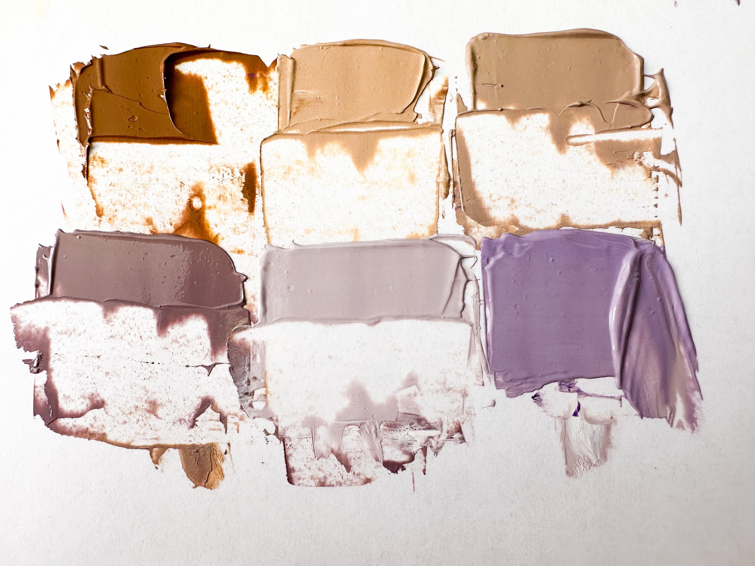
Today’s painting is an abstract because the abstracts let me just play and practice mixing colors. They’re my low stress paintings. I feel like there is a bit less to think about since I’m not trying to make the painting look like an object. I used the same base colors as the other day !! (titanium white, yellow ochre, cobalt violet, ultramarine violet) in addition to blue black. I played around with mixing and extending to get these six additional colors.
Cowrie Shell
Cowrie Shell
Today’s painting is based on a shell my uncle found in Kenting, Taiwan. Literally the reason I know what kind of shell this is, is because of Animal Crossing: New Horizons and picking up a bajillion of these on the shore in the game. And then I got one in real life! How cool is that?
Anyways, isn’t it wonderful how nature came up with this splendid complementary color palette? Here I’ve got titanium white, yellow ochre, cobalt violet, ultramarine violet.
I mixed and extended these base colors with white. Also added a bit of the yellow ochre to the purple mixtures to help tone down the brightness. I learned this trick from Think Big, Paint Small (see my Tiny Paintings blog post).
I decided to try an overhead view and mostly forgo a background. I really struggle with backgrounds and remembering there is a background and the fact it’s better to choose the background color(s) AND paint the background first!
Anyways…
For the shadow, instead of a grey, I tried a lighter version of one of the purples. This was something we’d do in digital product design. For example, if you had a blue button, you wouldn’t want to use a black or grey drop shadow, but rather the same blue and tweak the opacity a bit (as described in this article). This looks less harsh and feels more lively and harmonious. I like experimenting with this idea in paintings as well so I’ll likely play around with it more in the future.


