One-Line Art and Procreate Brush Studio
Class: Level Up Your One-Line Art with Procreate Brush Studio by Attabeira German (Disclaimer: if you sign up through the link, we’ll both get one free month of Skillshare).
This class teaches line art in Procreate as well as an introduction to Procreate brush studio. We start with using three ready-made brushes that come default with Procreate. These brushes are dry ink, monoline, and syrup. Dry ink has a small taper and a rough texture to it. Monoline has a single stroke width. And syrup is a smooth line with a lot of taper so it is pretty sensitive to pressure. These are my first three cats in the image below.
For the second part of the class, we take a look at Procreate brush studio. I was very interested in the stabilization setting since increasing this setting helps keep the lines from being wobbly or jittery. I have this problem with wobbly lines when drawing on iPad, but not so much on paper, so this was really confusing me before. I’m happy Attabeira linked me this class in response to my other one-line art project. I decided to edit the dry ink brush since I enjoy the rough texture of the brush, and increased the stabilization and taper. This is the fourth cat in the image below.
Abstract One Line Face Drawings
Class: Abstract One-Line Face Drawings: Discovering Your One Line Art Style Using Procreate by Attabeira German (Disclaimer: if you sign up through the link, we’ll both get one free month of Skillshare).
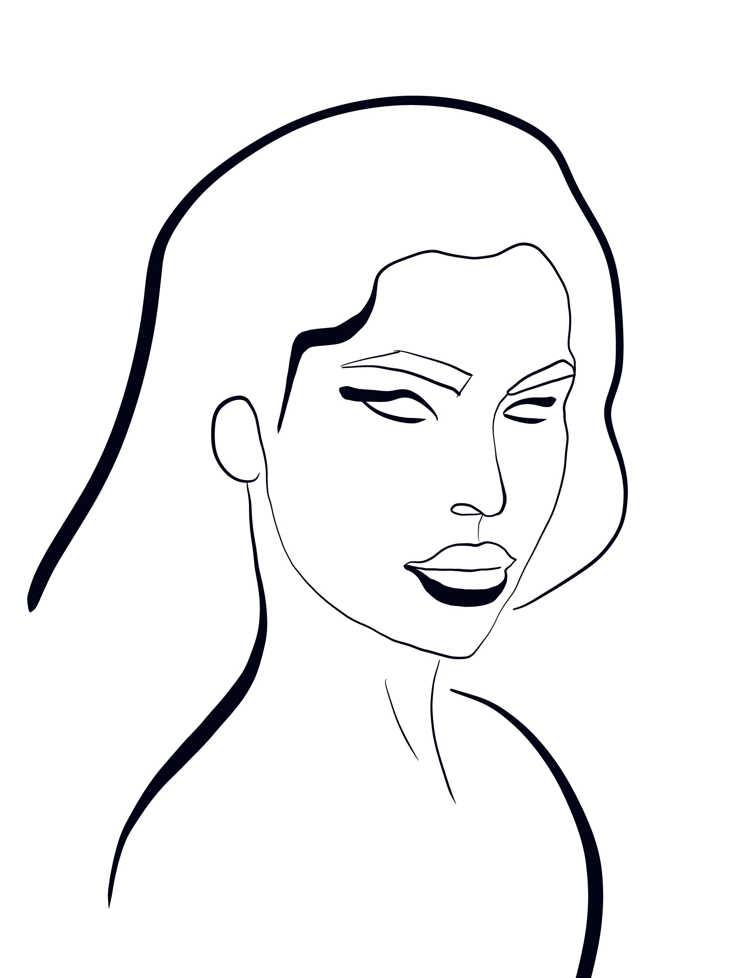
This class teaches abstract line drawings, surveying 4 different styles from different artists on Instagram: amorphous, curved, geometric, and thick and thin. I was drawn the most towards the thick and thin style, it felt more feminine and elegant to me. The curved style kind of reminded me Picasso, especially the examples we looked at in the class. The geometric style seems more like a man’s face to me than a woman’s. Perhaps it’s the pointy chin or the angular eyebrows?
Drawing in one continuous line for the whole drawing takes a bit of pre-planning for start and end points. This is why my curved style sample is missing a shoulder.
After going through the four styles, the class project is to take what you’ve learned and the parts you like from each style and create something of your own.
Amorphous one line drawing style
Curved one line drawing style
Geometric one line drawing style
Thick and thin one line drawing style
With the project for my voice, I chose to emphasize certain features like the hair, eye lids, bottom lip, and shoulders with thick lines and to deemphasize other features using thinner lines. I'm hoping the thicker lines draw the eye more towards those areas. This kind of reminded me of brush lettering and how downstrokes are thick and upstrokes are thin. I’ve always liked the juxtaposition of thick and thin strokes in brush lettering and wanted to channel some of that into this piece as well.
“My voice” version
Something I struggle with in Procreate is drawing smooth lines in general, especially the longer the line is or if it changes direction. You can kinda see this on the chin/jawline. How the line is unintentionally wobbly. Does anyone have any tips/advice on how to draw more smoothly? I was going through so many cycles of undo/redraw and still couldn't figure it out. Let me know in the comments below. And thanks in advance!
Surfboards 02
This is a remix of a class project I did at OCC a few years ago in my 2D Color and Design class. I redid the project in Procreate. The original was in acrylic on paper. For some reason, it is a lot easier to paint inside the lines with acrylic on paper than it is with Apple pencil on iPad. My process included an initial run applying all the colors to their individual areas on the surfboards, followed by an extended clean-up and smudging effort to fix any holes, especially holes between shaped and where multiple corners meet.
My favorite is the pink surfboard, third from the left. My favorite color is pink, I just had to have one for the monochrome board. What’s your favorite? Let me know in the comments below!
Surfboards 02
Still Life 2
I really love this one because I love all the colors. And how each vase is unique, and how each vase has it’s own little flower(s) popping out. It makes me happy to see all the different colors work together harmoniously.
I might turn this one into a greeting card or a print. What do you think? Let me know in the comments below!
Still life 2
Pitcher with Pears
I worked on this one on and off for a few months. My favorite part is the pink pitcher, especially the slightly lighter pink color on the inside of the pitcher versus the outside. In the original reference photos, those pears were a different color and likely an entirely different fruit. However, green was what I was feeling (and what was available in my color palette). Plus I enjoy the contrast with the pink.
Pitcher with pears


