Milan Art Institute Mastery Program Review: Week 7
I was a bit nervous for this week as it is about perspective, which has typically been challenging for me. I feel it’s the use of the straight edge that puts me into left brain mode, then suddenly I need everything to be pixel perfect.
This week also took me a while to get through (which is why this was published on the 25th instead of the 11th). And starting this week, I’ve also been trying to increase my speed. So this might lead to more unfinished assignments while I attempt to stay within the time limits for each assignment.
One Point to Three Point Perspective
One point perspective has vertical and horizontal lines. Two point perspective has vertical lines, but no horizontal lines.

Three point perspective has no vertical and no horizontal lines. All the lines are at an angle.


The first practice assignment. I learned the letters in “One Way” and “Broadway” need to be drawn in perspective as well. Totally didn’t realize that before!
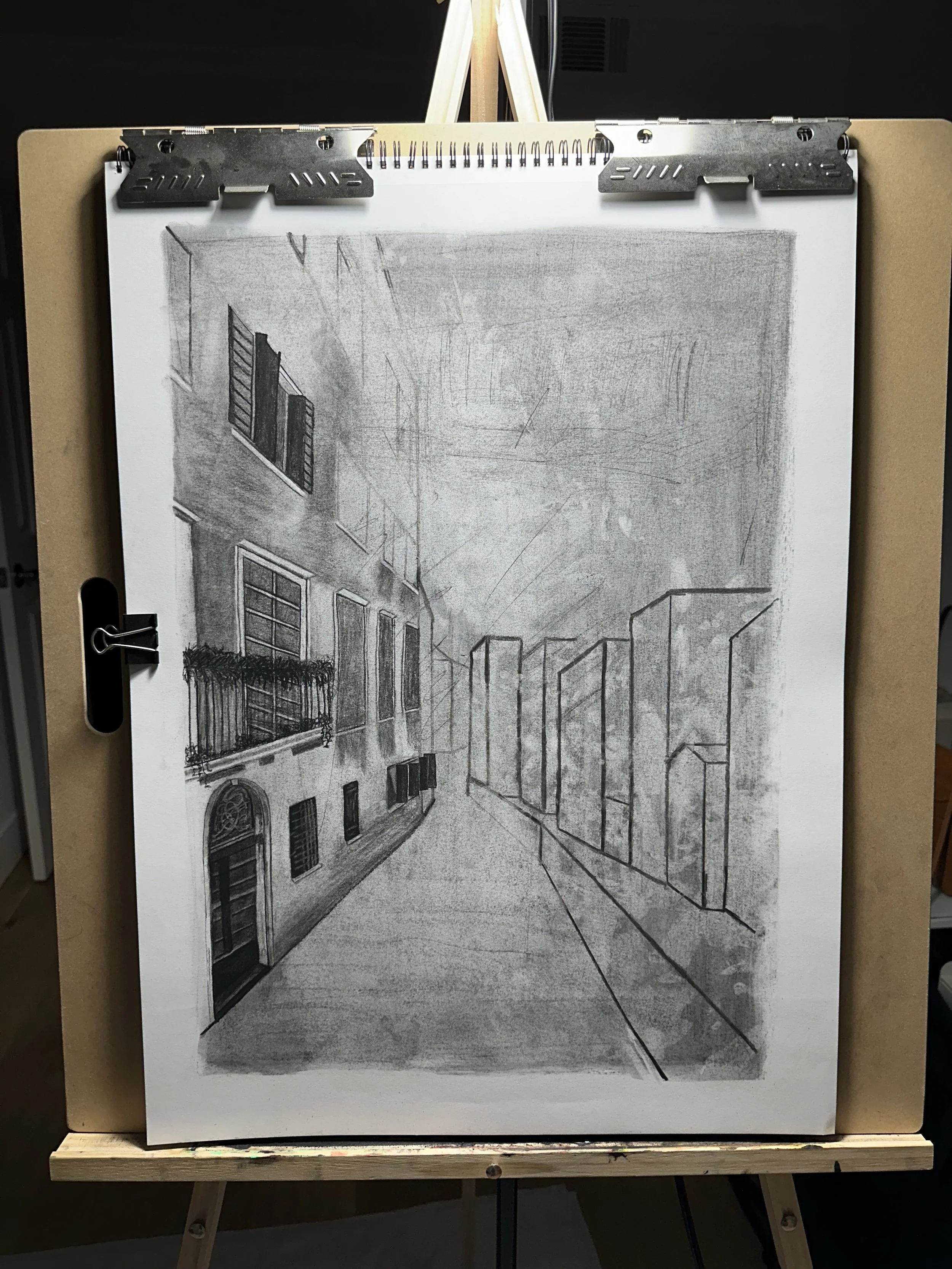
Charcoal City Subtraction
Similar to previous charcoal assignments, we start with making a ground, then subtract the highlights, and add in the darker values. Concentrate on the biggest parts of the source first, then work down to the details. 3 hours maximum on this assignment.

Crowd of People with Charcoal
Start with the ground, then subtract highlights, add darker values. Try looking at the crowd as a whole, instead of isolating single people. I’m imagining the crowd needs to be kind of blobby and abstract to reduce the amount of visual information. A tip that really helped me: when subtracting out, look for the negative space. Also, don’t outline the people. Concentrate on getting the appropriate tone next to another tone in order to create shapes and edges.

Subtractive Underpainting, Creating Depth, and Opaque Details
Similar process to previous paintings. Choose 4-5 cool transparent paints for the background. Look at value instead of color. Subtract out the light parts. And don’t forget to always mix black with another color so it looks more natural.
Next is a quick glaze layer. I felt this really helped with parts of the painting where the sunlight is hitting the buildings. Using a transparent yellow gives that sunshine-y glow while still allowing the underpainting color to show through. Glaze light to dark, then it’s time for the first opaque layer.
For the opaque layer, I worked background to foreground, and dark to light. Pick one area as the focal point to add more detail in, while leaving the rest of the painting looser and more abstract.
Finally, for opaque details, this is another opportunity to use the cold wax medium to add some texture to the painting. Texture works best on parts of the painting that are coming out towards the viewer. So it is a great candidate for warmer areas, like places where light hits the buildings.

Halfway through the first opaque layer

Detail shot of the people in front of the restaurant. This is my favorite part so far.

Final version