Milan Art Institute Mastery Program Review: Week 3
Plane Shifts
A plane shift is where two planes meet, creating a corner or point in the contour. This week we’re working on a cardboard box still life in charcoal for the drawing class. We need to find a cardboard box, this is what we’ll use to practice the plane shifts, and then put some objects in it. I chose a stuffed animal I got for Christmas one year from my aunt and then one of the tennis balls lying around the house.
My still life for this assignment
We start by making a ground using willow charcoal. So, I learned willow charcoal will only go up to a value of 5. (If it seems darker, it’s just the pigment laying on top of the paper.) Remember the value scale from last week? Values range from 1-9 with 1 being the lightest and 9 being the darkest. Yep, so 5, right in the middle. How convenient! This makes it easy for the next steps - initial sketch, subtract the highlights, add in the darker shades, and violà!
Initial ground in willow charcoal
Subtract the highlights
Add in the darker shades with compressed charcoal
We also learned about chiaroscuro which is a strong contrast between light and dark. An example in my drawing above, look at the left side flap of the cardboard box. To the left of the flap is middle grey 5, then comes the edge of the box which was in shadow. Then a light highlight, and finally a darker shadow on the flap. So it is like alternating light and dark to integrate the foreground object into the background.
Monster Portrait
We’re using three paints here: transparent earth yellow, alizarin crimson, and mars black. These should all be cool colors. Unfortunately, I didn’t have mars black or any other cool toned black, so I ended up using van dyke brown, which is a warm transparent. Hopefully things will still turn out okay!
We’re working light to dark and blocking in the light, medium, and dark areas using the corresponding colors. Yellow for light, crimson for medium, black for dark. Then we pull out highlights with the subtraction tool making sure the head tilt and the eye to nose measurement is correct.
So far, it is looking pretty monstrous. I’m hoping the painting is just at the ugly stage right now and it’ll get better as we go along. Fingers crossed.
Subtraction step for the monster portrait, source photo to the left
Flesh Tones and Complements
So, first, I completely adjusted her and made her head bigger. I kinda feel like I placed her head too high and the painting would look better with more space at the top. In this layer, we’re starting with the filbert 30 and blocking in the larger areas of color along the plane shifts. To make the flesh tones, we mix two complementary colors together. Complements are red-green, orange-blue, and yellow-violet.
Second layer of paint on the monster portrait
Painting Plane Shifts
So here, our task is to finish up the painting, with each plane shift as its own distinct color. The woman’s face in the source photo had pretty distinct highlights and shadows with many orange and red tones. Looking at my finished painting below, she kind of reminds me of the Titans from Attack on Titan. All the different blocks of color for the plane shifts feel similar to the exposed muscles and ligaments on the Titans’ faces.
Monster Portrait, final
Blocking in a Charcoal Portrait
This drawing is like a combo of the other two assignments. We use similar methods to before. First doing a loose drawing of the subject with emphasis on the dark areas to subtract out of. Then work on subtracting out highlights, then adding darker areas.
I chose the source photo of Audrey Hepburn. She’s my mom’s favorite actress and we used to watch her movies (Sabrina, Charade, How to Steal a Million) when I was a kid. It is kind of funny, the ones we watched together weren’t even Hepburn’s most famous ones like Breakfast at Tiffany’s or Roman Holiday.
Anyways, I think I pressed too hard with the charcoal on my initial drawing. There’s some marks on her face that would not erase out. Good lesson learned here, be more gentle. I am very pleased with how her hair came out.
Charcoal drawing of Audrey Hepburn
Materials used
Milan Art Institute Mastery Program Review: Week 2
Shading and Value Scale
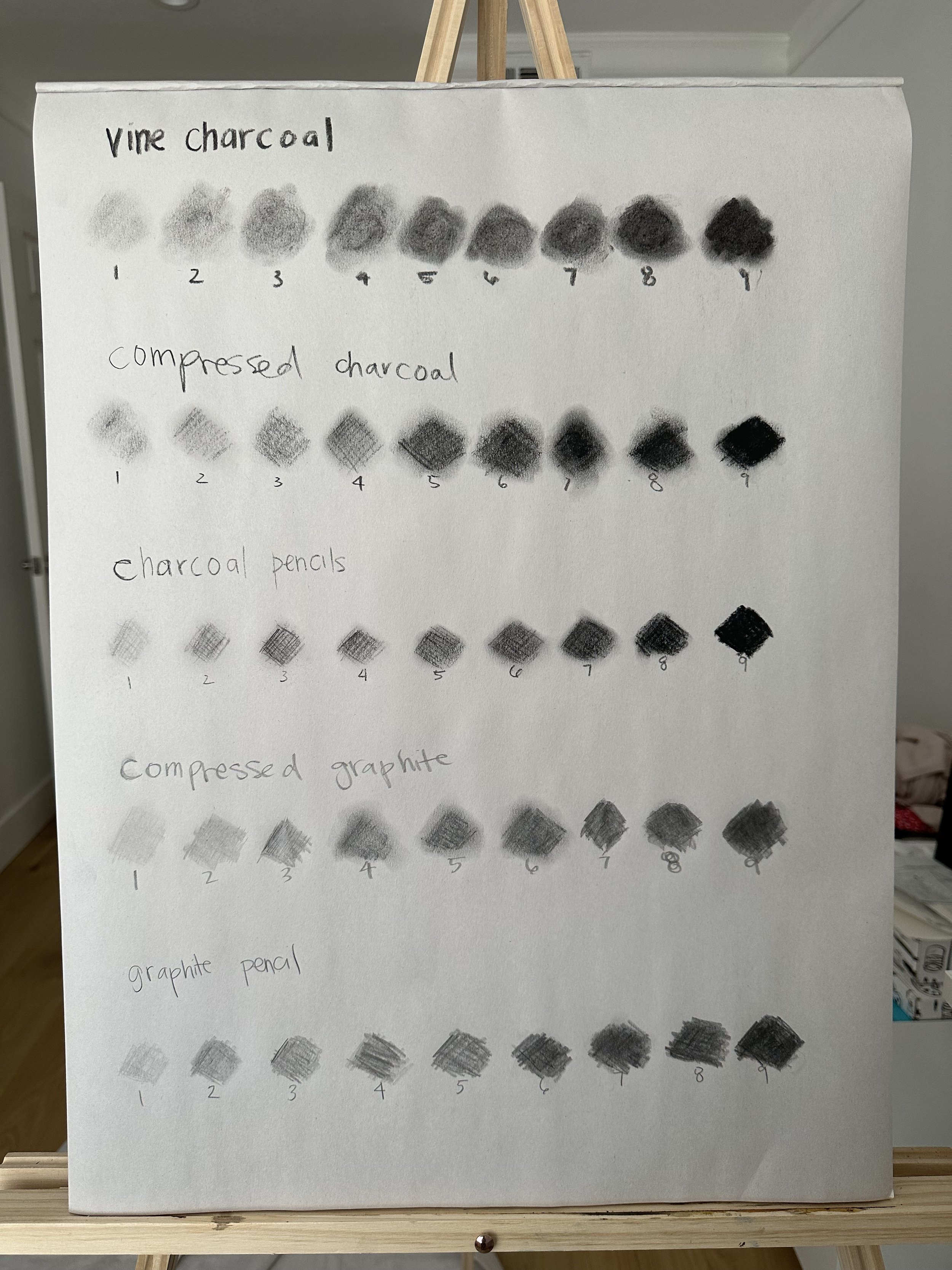
So for week 2, in our drawing class, we are learning about shading and values. The value scale goes from 1-9 with 1-3 being highlights, 4-6 midtones, and 7-9 would be the darkest shades. 5 is the middle grey.
For the value scale assignment, I created scales using different types of charcoal and graphite. I also tried practicing cross-hatching to make the scales.
Vine charcoal felt like it was the easiest to use and the most forgiving, which is why it is recommended for beginners. With the vine, it’s very soft and I could take a lot off the paper by rubbing with my finger, so it was easy to erase when I made mistakes. Vine charcoal is made from burning grapevines and is slightly harder than willow charcoal, made from willow branches (source). Initially I was confused between the two, but they are different.
Charcoals were also a bit more dusty in my opinion. Softer and easier to get a very dark shade. Graphite is basically pencil lead. The compressed graphite felt like holding a thick stick of pencil lead and the graphite pencils were just regular pencils.
Shading and value scales in different types of charcoal and graphite
Radiant Underpainting
For week 2’s painting part of the class, we are using the Gamblin Radiant colors. The first step of the process is the underpainting. Here we are focusing on just the colors, not the values for this assignment. We want to block in the basic colors from the source photo. Since this is a landscape, we have an atmospheric or clamshell perspective. So we want to use cool colors on the horizon line, this is the part of the painting that is receding backwards. We want to use warm colors closer to the top and the bottom of the painting as this is the area that is coming forward or approaching the viewer.
Radiant underpainting
Spheres Shading and Value Drawing
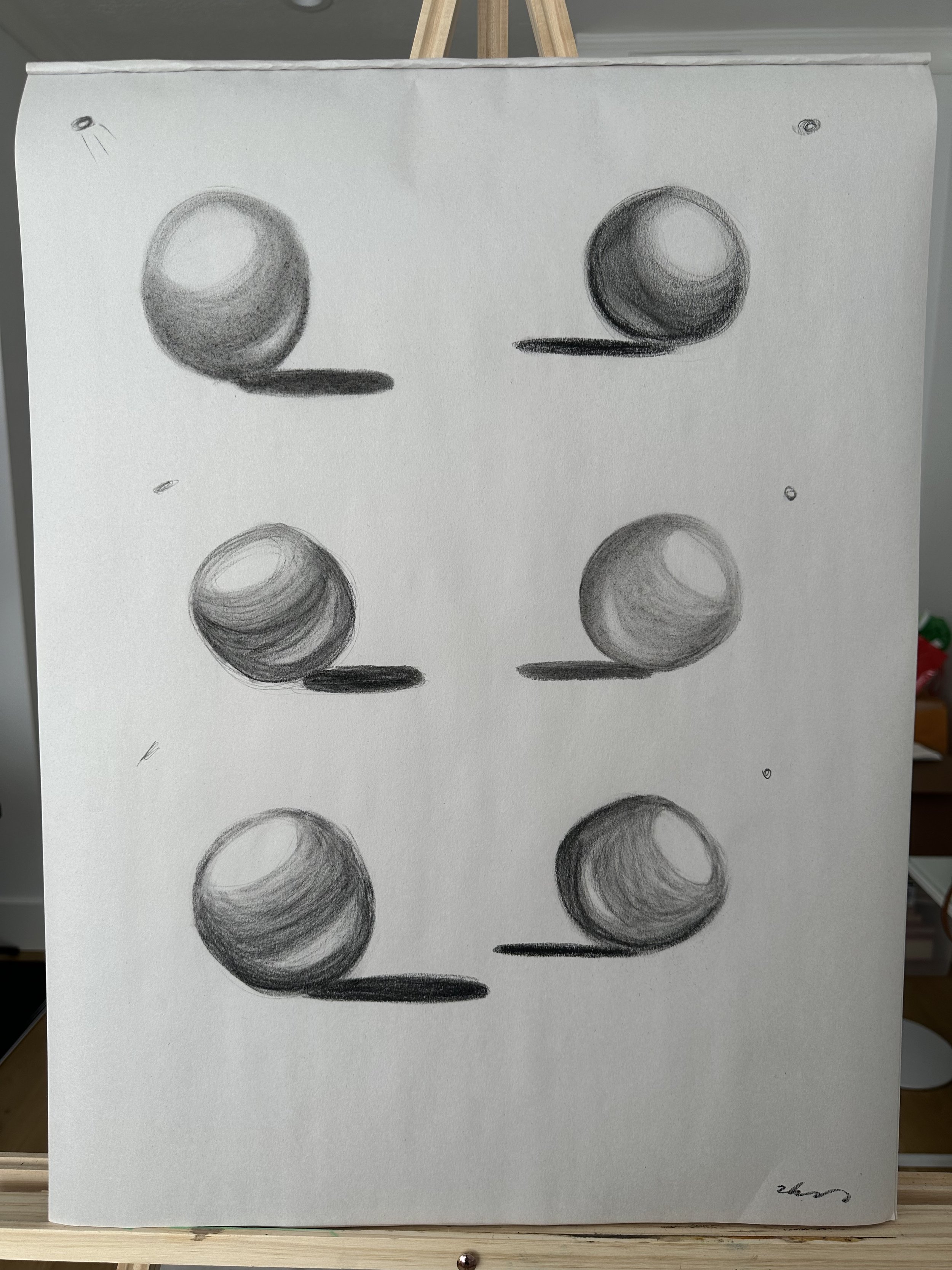
Now back to drawing class. The drawing and painting assignments typically alternate. I thought this was nice and I believe the purpose is to allow enough time for the painting to dry. I also like alternative activities as it gives some variety. For the spheres assignment, we draw several different spheres with different light sources. I used the different charcoals I had also - vine, compressed, and pencil.
Spheres charcoal drawing
On each sphere, there are several areas we want to make sure to include. The first is the highlight, which is the lightest portion at the top of the sphere were the light is hitting it. The core shadow is the shadow around the body and bottom of the sphere. The reflective light is a highlight within the core shadow, above the cast shadow, which is the shadow the sphere casts on the ground or surface the sphere is sitting on.
The other graphite drawing assignment is the three pears. There are three pairs sitting in a row on a semi-reflective surface, so the pears also have sort of mirror shadows below them. The time limit on this one was 1.5 hours and I ended up rushing at the 20 minute mark. I got really in the zone and lost track of time. Overall, I’m pleased with how they turned out, especially for only being week 2.
Subtractive Glaze
This is my favorite part of the oil paintings - the subtractive glaze. We used the same linseed oil and solvent mixture from week one. For the glaze, I used ivory black plus dioxazine purple. The instruction is to use ivory black in addition to a cool transparent paint. This paint should be the darkest shade in the source photo. My source photo had a purple hue on its darkest parts so I chose dioxazine purple since that’s the cool transparent purple I had on hand.
So the goal here is to subtract out the mountains, grasses, etc. to uncover the bright colors underneathe. To subtract, I mostly used paint brushes and q-tips as I seem to have misplaced my Kemper Wipe Out Tool. This is why a clean and organized studio is important! (As you can see in the little bits of background to the sides of my easel, I am slowly working on getting cleaner and more organized.)
Subtractive glaze phase of the painting process
Opaque Layer
Similar to last week, opaque painting is dark to light and starting with what’s furthest away to what is closest.
Unfortunately, my painting did not turn out how I wanted it to. I had trouble representing the fog by the base of the mountains and also reflected in the water. In fact, it is not clear that the reflection of the mountain is because there is a lake there. I feel I need more brush stroke variety as well. Some parts like the left corner of the sky feel too smooth.
I had a tough time mixing colors on the fly as well. I was pleasantly surprised the grass and flowers turned out not too bad, especially in the middle and right hand sides (when looking at the painting). So now I am wondering, how do I mix colors better? Better as in quicker, more accurately, and in the appropriate amount?
Final radiant painting
Overall, I had a fun time with week 2 as well. Considering how many paintings I’ll create this year, some of them are bound to be duds. And that’s okay! It is all part of the learning process. Let me know any thoughts or questions in the comments. See y’all next week for week 3!
Materials used:
Milan Art Institute Mastery Program Review: Week 1
For the first week of the Milan Art Institute Mastery Program, I’ll be painting my very first oil painting. We’ll be learning subtractive painting and the first step is to paint the entire canvas in van dyke brown mixed with 1 part linseed oil and 6 parts solvent. This is the ground for the underpainting to subtract out of.
Creating the ground to subtract out of
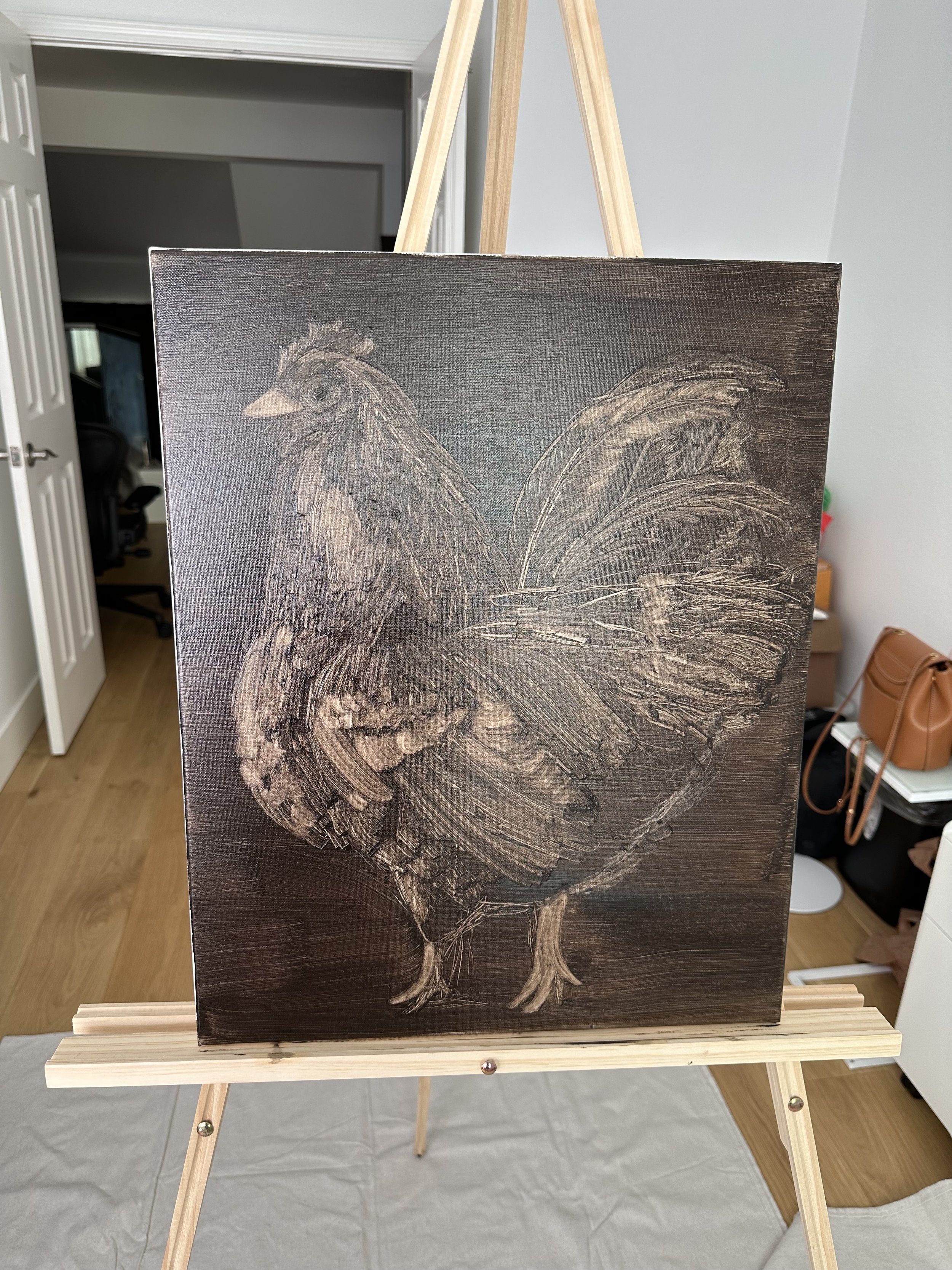
Next, we sketch in big stuff first and then add details in later. Here we are concentrating on values. The lightest areas in the source photo will be the lightest value areas in the painting. The source photos for this assignment were different types birds to choose from. I went with a chicken because one day, I would like to own some pet chickens. I also think they are very cute.
My chicken
Subtractive painting is pretty fun! It’s basically removing the paint from the areas that you want lighter. If you make a mistake, it can be fixed with a brush to move the paint back to where you want it. Now we need to wait for the painting to be completely dry before moving on to glazing. The dry time takes about a day.
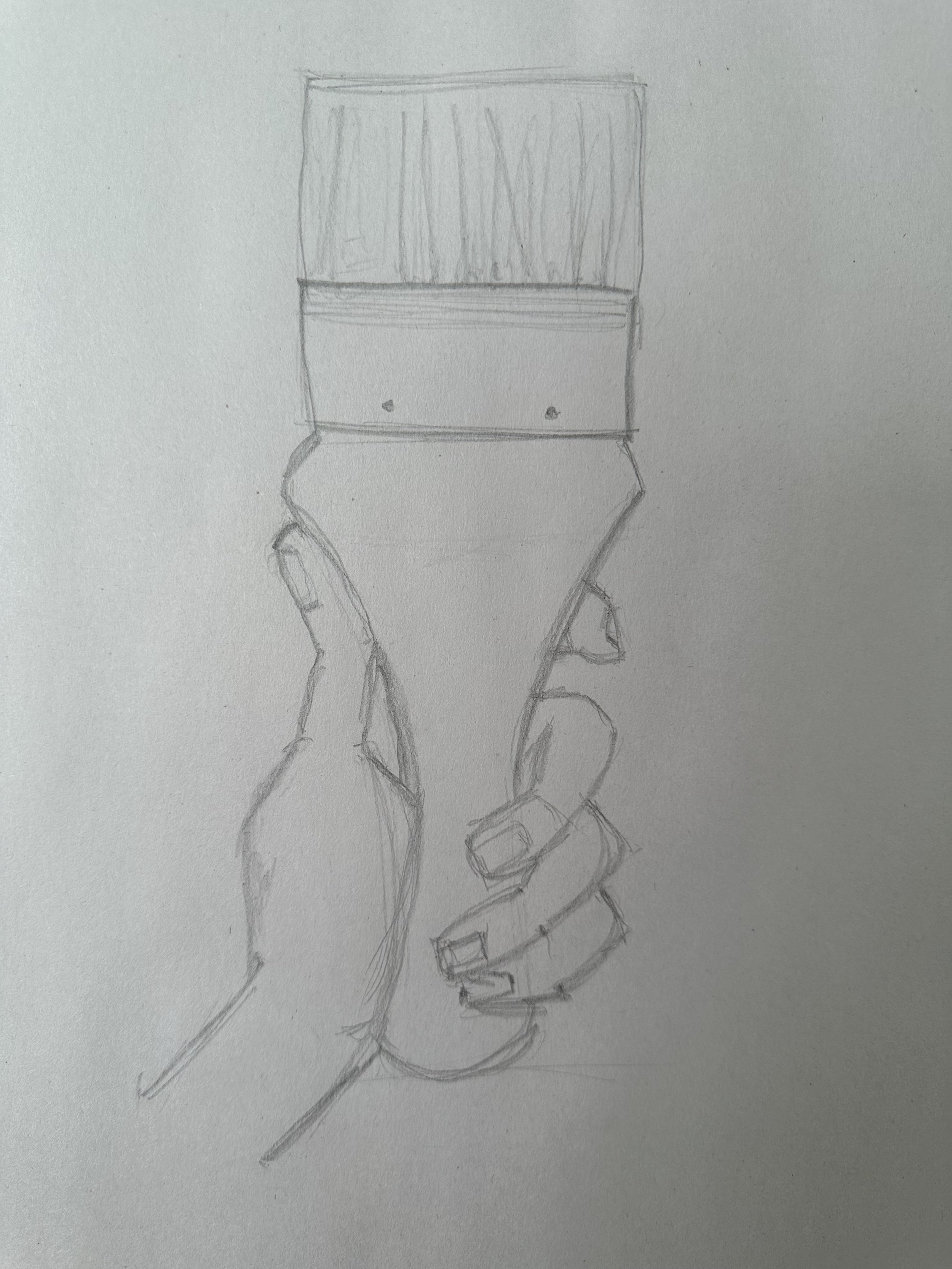
So, in the meantime, in the drawing part of the class, we are learning about proportion. Standard of measurement is the reference used for the drawing. Proportion is width and length. Here we are working on a drawing of a brush in our non-dominant hand. Start out by drawing the brush first and then figure out the hand using proportion.
Brush in hand drawing
We also learned how to use the scale tool to draw proportionally. The smaller side is for measuring the object and the larger side is for the corresponding measurement on the paper. In order to make the drawing bigger, move the bolt to be closer to the smaller end, thus making the larger part even larger. To make the drawing smaller, do the opposite and move the bolt to the larger end so there is less space available on the larger end.
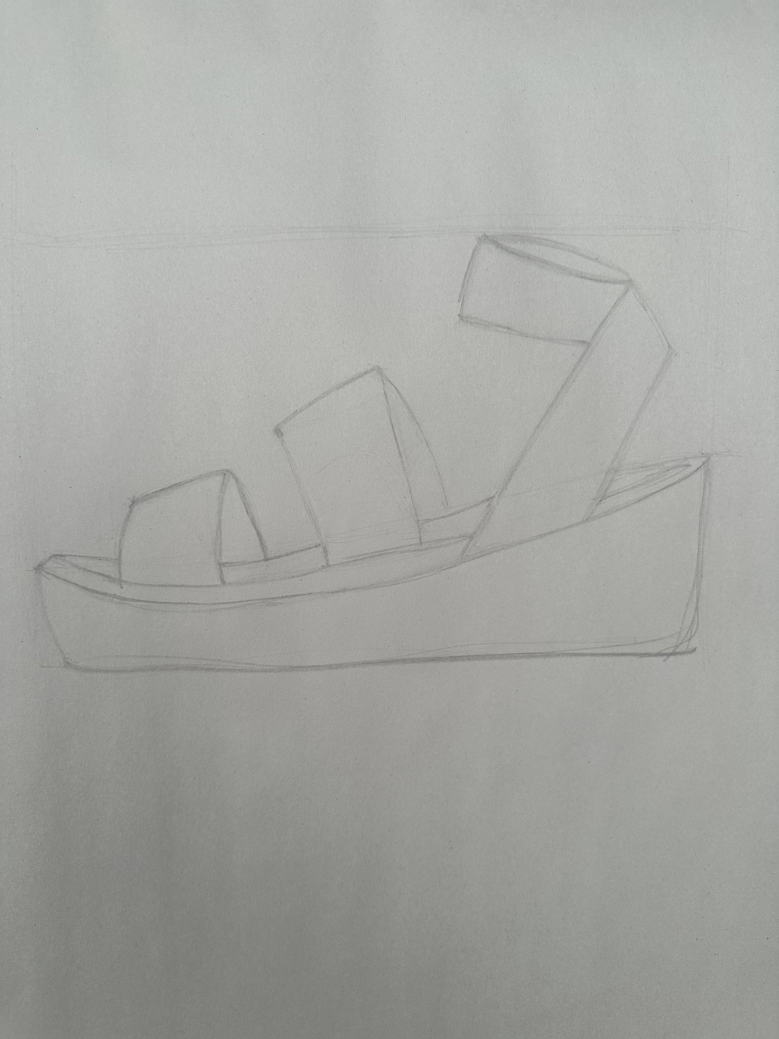
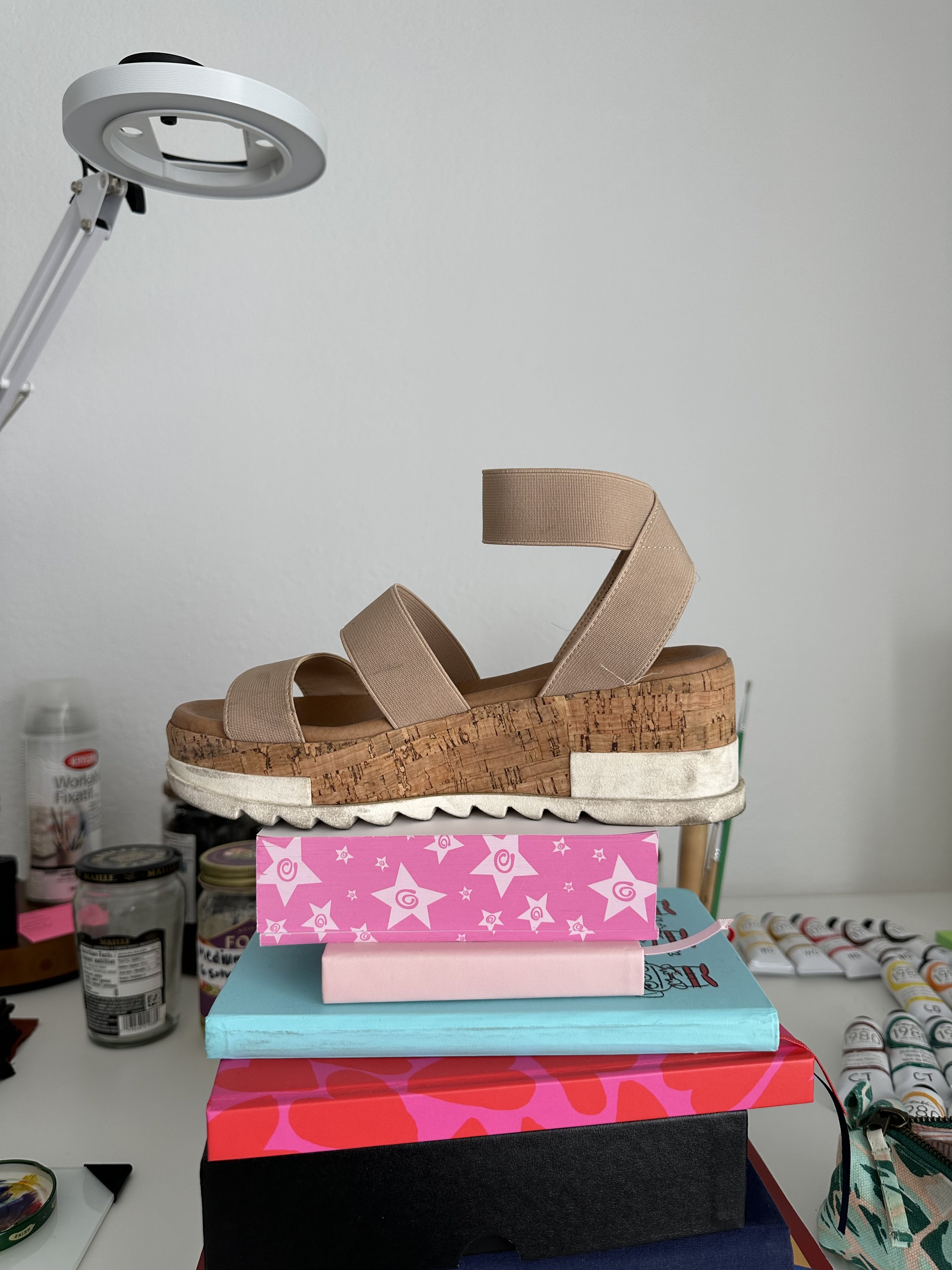
I chose one of my wedge sandals for this drawing. The first step is finding the height and width of the shoe, making a box that the shoe will go in.
Shoe pencil drawing
My wedge sandal
Back to the chicken painting, the next step of the process is the opaque layer. For opaques, we paint dark to light, ending with highlights and do the background first so the bird looks like it’s in front of the background. Here my intention was to capture the feeling of the feathers with the brushstrokes.
Chicken painting is finished!
Now my first oil painting, the chicken, is finished! This week was fun and I enjoyed learning new things and experimenting with different materials that I hadn’t used before. I’m excited to start week 2! I’ll be blogging about my experience in the program here. A new blog post will be released each Monday until I complete the course. Have any questions for me? Leave a comment below!
Materials used:
Lightwish Acrylic Paint Markers Review
Lightwish Acrylic Paint Markers
Disclaimer: I received this product in exchange for an honest, unbiased review. I do not receive a commission if you click on the links or make a purchase. See full disclosure and disclaimer policy here.
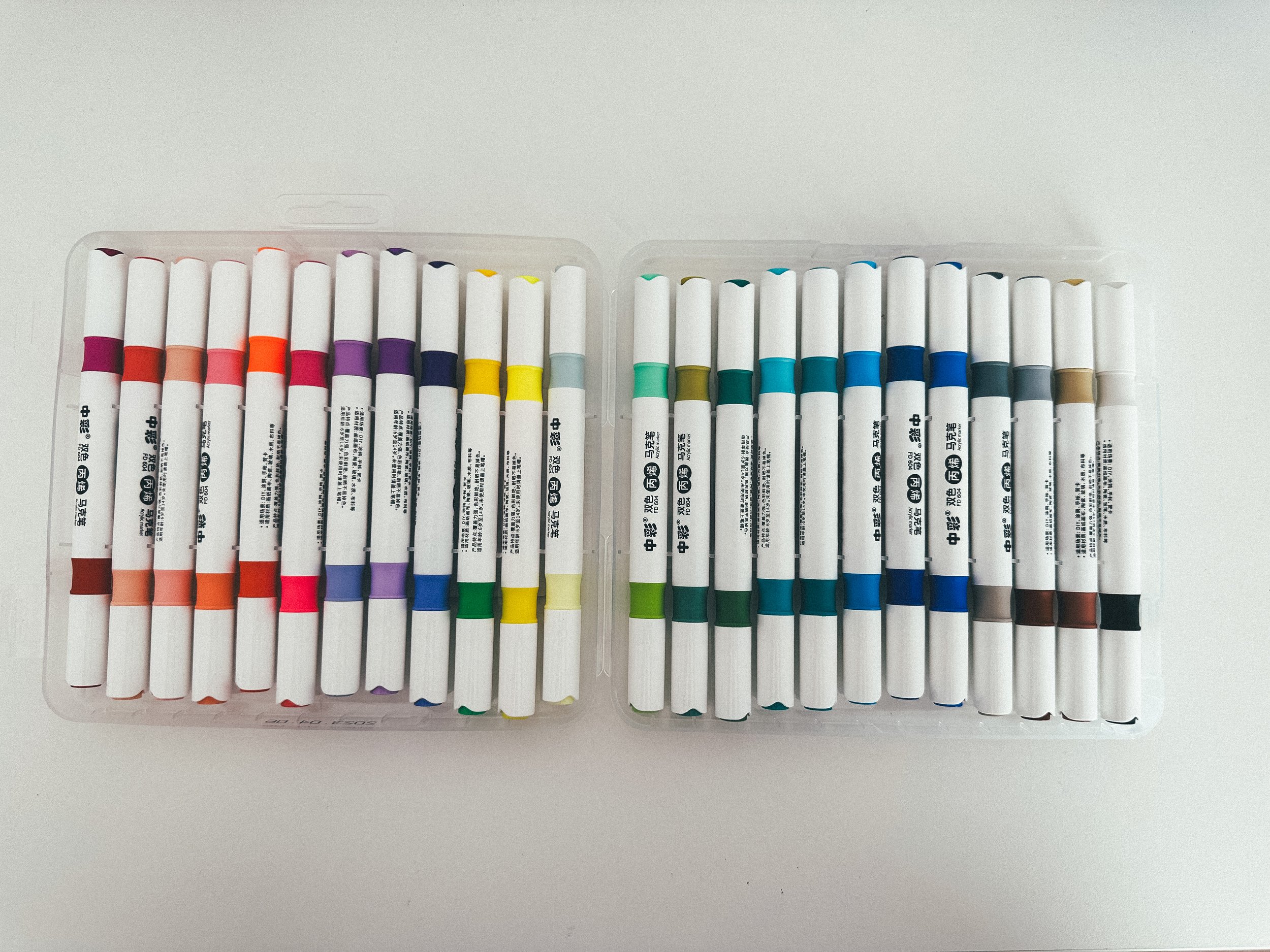
Hi everyone! Today I’ll be reviewing Lightwish Acrylic Paint Markers. These are water-based inks with a dual-tip design and a brush pen tip. When I received these markers, the first thing I noticed was how nice the carrying case was. The plastic feels sturdier, has little close tabs on the sides and top, and each marker has its individual place within the case so they do not move around. The markers easily pop out and snap back in to their spots too.
Front of package
Back of package has little swatches with corresponding numbers for the colors
The back of the package has small numbered swatches that indicate the color. The number is also on the cap of the pen. The tip of the pen is a brush pen type tip which I really enjoy since this allows for both a thin and a thick line from the same marker. The caps are easy to take off and put on. They make a little clicking sound to indicate you’ve got the cap on correctly and tightly.
Brush pen tip for the marker and numbered cap
The colors are really beautiful. I especially enjoy the range of pinks, oranges, and purples in this set. Of course, pink has been my favorite color since I knew what colors were and in this set, 25 really catches my eye. I also really enjoy the blue-greens like 35 and 99.
At first, I thought the numbers would indicate an order the markers could be organized in and this would somehow arrange the markers by color and value. However, the numbers don’t seem to be indicating any specific order. In this picture below, 45 and 46 aren’t really close in hue or value.
Swatches of Lightwish Acrylic Paint Markers
I did notice some markers are more translucent and some markers are more opaque. In the example below, I used the same black marker to make the four vertical lines and then used one of the Lightwish markers on top. 34 is much more translucent. The black lines strongly show through. It is almost difficult to tell the acrylic mark is on top of the black lines. While 148 is more opaque, here it is definitely clear the acrylic is on top of the black lines. 99 and 35 are also more opaque.
Translucency test
I actually thought this difference in opaqueness was pretty cool. I’m currently learning oil painting and using transparent vs opaque oil paints. So I saw an opportunity here with these markers to try laying the more opaque ones over the more translucent ones.
With the more translucent colors, it is quite visible where the any marks overlap since the overlaps darken the color. This has potential for some cool effects and appearance of texture.
I also really enjoy the more opaque colors, they’re thick, rich, and solid.
Sketchbook thumbnails
Overall, I was very pleased with this pack of markers. I see myself reaching for them frequently, especially for my sketchbook and on the go. The sturdier case gives me more confidence taking the markers in my bag. They’ll stay in their case and won’t get lost or spill. There’s double the amount of colors since the markers are dual-tip and a great color range to suit many types of creations.
Lightwish 48 Colors Acrylic Paint Markers
83: Blueberries
Blueberries are small, round fruits that pack a powerful punch of flavor. Known for their deep blue color and slightly sweet taste, blueberries are versatile fruits that can be enjoyed in various ways. Whether eaten fresh on their own, mixed into yogurt, blended into smoothies, or baked into delicious pies and muffins, blueberries offer a burst of freshness in every bite. Not only are they delicious, but blueberries are also rich in antioxidants and vitamins, making them a nutritious choice for any diet. Whether enjoyed as a snack or as part of a flavorful recipe, blueberries are a delightful fruit that never fails to satisfy taste buds.


