Daily UI: 006 User Profile
I feel like I need different ways of decorating the background of these mockups other than my opaque circles. The UI on this was actually relatively simple - basic profile information like a photo, name, location, “posts”, friends/followers, and following.
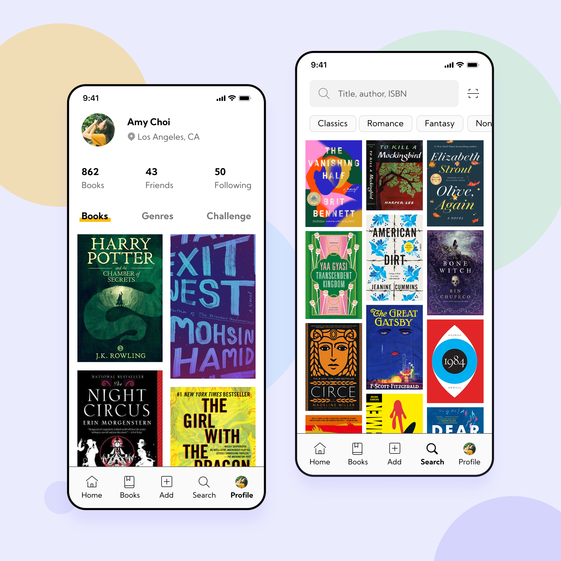
I also did a screen for what the search page would look like. The idea is the user can search by title, author, or isbn. There’s also a barcode scanner to the side of the search bar. Simple quick filters by genre that scroll horizontally. The most popular genres are displayed first on screen. Followed by a curated grid of books that are suggested according to user preferences based on what books they’ve read and how they’ve rated them, as well as books in the user’s “want to read” list.
Looking back on this, I’d change the color of the bottom tab bar icons and labels to a lighter color grey. Currently, they seem like they have too much visual prominence. I also struggled with deciding to include the labels or not. I typically like to include labels for clarity since users might not know what the icons mean by themselves. Looking at other social media apps, it seems like they don’t use labels. Seen here in Twitter and Instagram.

Twitter tab bar

Instagram tab bar
When weighing between a more simplified UI and usability, I ended up using the labels for clarity anyways. I do appreciate the subtle indicators for the page the user is on, with either the color or the bold icon.
I also tried a new font today - Kumbh Sans. There’s only three variants: light, regular, and bold. At first, I thought that might be restrictive, but for these screens with minimal text, only have a few options helped me make decisions more quickly.

Typography and color palette for this project
One issue I ran into, whether that’s with the font file or with how Figma rendered it, was that the bounding box around the text doesn’t appear to center the type within the box. Below is a comparison with Nunito Sans which works nicely in Figma. No matter how I messed with the settings or changed the line height, Kumbh Sans always had the text at the top of the box.

Some weirdness with the bounding box in Figma with Kumbh Sans versus Nunito Sans