Daily UI: 007 Settings
I tried something a little bit different this time with those background circles by adding a layer opacity. It’s interesting cause it seems like it adds depth, like those circles are clearly in the background and far away. Also added an oval in there. Can you spot it?
Definitely one of the quicker Daily UI challenges that I’ve done. A settings page seems pretty bland to me, in terms of styling. So I chose to showcase a Financing settings page instead. This is similar to a product that I work on in real life. Basically, a user submits their personal information for a pre-qualification, doing a soft pull of their credit. The user receives a pre-qualification offer, based on their credit score, which includes the maximum loan amount, rate, and term.
Looking at it again, the spacing between “You’ve been pre-qualified for” and the numbers is bothering me. It looks like it needs a little bit less spacing.
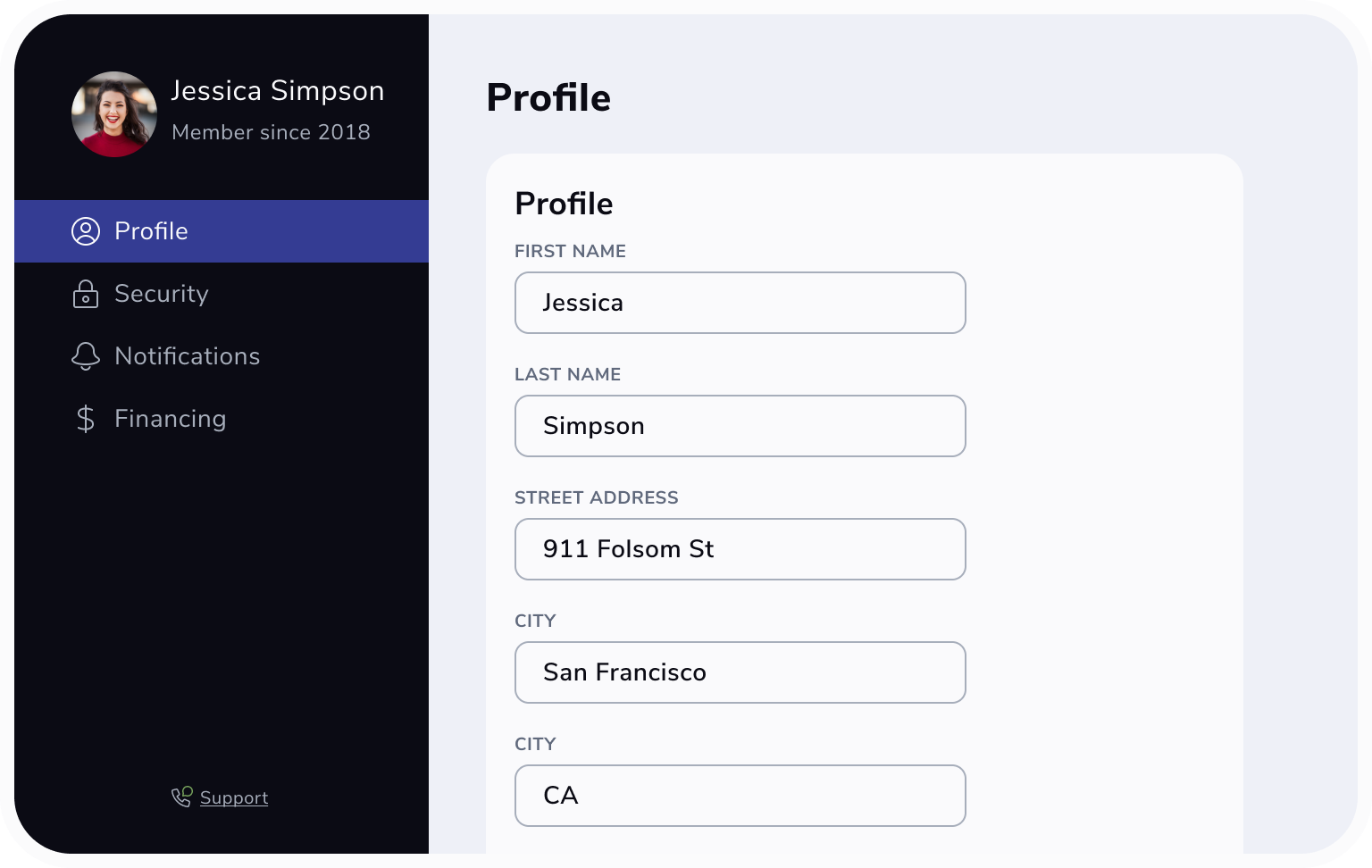
I did another screen for Profile, which is just a series of cards with input boxes the user can edit and save their information.
This one didn’t make it in to the final mockup. Laying it out with the Financing screen, I felt it was a lot of repeated elements in the sidebar to show side-by-side. The Profile card didn’t have anything super special either.
I also just noticed the card says Profile and as well as the header for the page. Seeing that now, I would change the card title to “Personal Information” or “Basics” since that contains information like name and address.
Styles for this challenge include Nunito Sans and a color palette featuring a number of grey shades.
This was my first time trying a dark mode UI. Personally, not my favorite but I know dark mode is very popular.
Sometimes I think these challenges turn out better when I do them over the course of a few days. It gives me more time to digest and revise.


