Milan Art Institute Mastery Program Review: Week 8 Part 1
While week 7 was all about perspective, week 8 is all about portraits. Portraits are visual representations of individuals, capturing their likeness and often expressing their personality or mood. Typically focusing on the person's face, portraits aim to convey a sense of identity or emotion. Artists use various mediums such as painting, drawing, photography, or sculpture to create portraits. These artistic representations can range from realistic and detailed to abstract and interpretive, reflecting the unique style and vision of the creator. Portraits have been a significant form of artistic expression throughout history, serving as a way to immortalize individuals, commemorate important figures, or simply capture a moment in time.
Portrait Proportions from Various Angles
This exercise is more of a practice warm-up. It is four different faces that I found on Unsplash. A few helpful tips:
Remember the position of the eyes is the in middle of the face. Not too high on the forehead.
The neck typically begins at the bottom of the ears.
The highest point of the eyelid points in the same direction for both eyes.
They came out a little cartoony on this first go around but that’s alright. The point of these is to practice and learn new skills.
The four faces
Drawing a Portrait from Life
I did not have a live model for this one. It’s typically difficult for me when the lessons ask for a live model. So, I do the best I can using reference photos. For this assignment I chose this photo from Unsplash.
For this drawing, instead of starting with a charcoal ground, we sketch in the general proportions with vine charcoal. Then block in dark areas with jumbo willow charcoal. Next, subtract out the highlights and add the darkest values with compressed charcoal.
Charcoal portrait
Working on his ear reminded me of working on Audrey Hepburn’s ear in week 3. It was significantly easier and quicker this time around. I feel this is evidence that all the practice builds on top of each other, which makes me really excited that I’m improving my skills.
Materials Used:
Milan Art Institute Mastery Program Review: Week 7
I was a bit nervous for this week as it is about perspective, which has typically been challenging for me. I feel it’s the use of the straight edge that puts me into left brain mode, then suddenly I need everything to be pixel perfect.
This week also took me a while to get through (which is why this was published on the 25th instead of the 11th). And starting this week, I’ve also been trying to increase my speed. So this might lead to more unfinished assignments while I attempt to stay within the time limits for each assignment.
One Point to Three Point Perspective
One point perspective has vertical and horizontal lines. Two point perspective has vertical lines, but no horizontal lines.
Three point perspective has no vertical and no horizontal lines. All the lines are at an angle.
The first practice assignment. I learned the letters in “One Way” and “Broadway” need to be drawn in perspective as well. Totally didn’t realize that before!
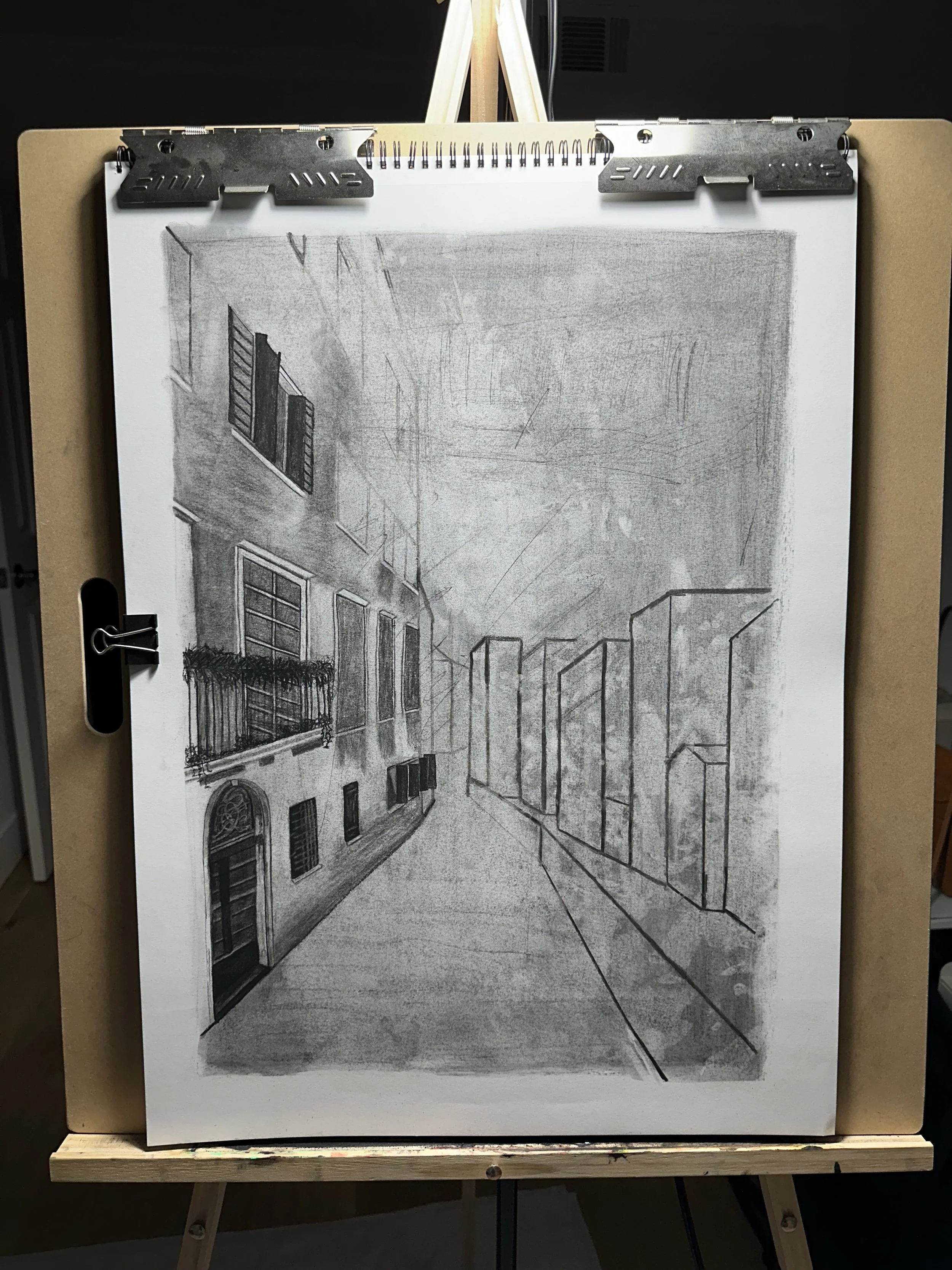
Charcoal City Subtraction
Similar to previous charcoal assignments, we start with making a ground, then subtract the highlights, and add in the darker values. Concentrate on the biggest parts of the source first, then work down to the details. 3 hours maximum on this assignment.
Crowd of People with Charcoal
Start with the ground, then subtract highlights, add darker values. Try looking at the crowd as a whole, instead of isolating single people. I’m imagining the crowd needs to be kind of blobby and abstract to reduce the amount of visual information. A tip that really helped me: when subtracting out, look for the negative space. Also, don’t outline the people. Concentrate on getting the appropriate tone next to another tone in order to create shapes and edges.
Subtractive Underpainting, Creating Depth, and Opaque Details
Similar process to previous paintings. Choose 4-5 cool transparent paints for the background. Look at value instead of color. Subtract out the light parts. And don’t forget to always mix black with another color so it looks more natural.
Next is a quick glaze layer. I felt this really helped with parts of the painting where the sunlight is hitting the buildings. Using a transparent yellow gives that sunshine-y glow while still allowing the underpainting color to show through. Glaze light to dark, then it’s time for the first opaque layer.
For the opaque layer, I worked background to foreground, and dark to light. Pick one area as the focal point to add more detail in, while leaving the rest of the painting looser and more abstract.
Finally, for opaque details, this is another opportunity to use the cold wax medium to add some texture to the painting. Texture works best on parts of the painting that are coming out towards the viewer. So it is a great candidate for warmer areas, like places where light hits the buildings.
Halfway through the first opaque layer
Detail shot of the people in front of the restaurant. This is my favorite part so far.
Final version
Milan Art Institute Mastery Program Review: Week 6 Part 2
Fat over Lean
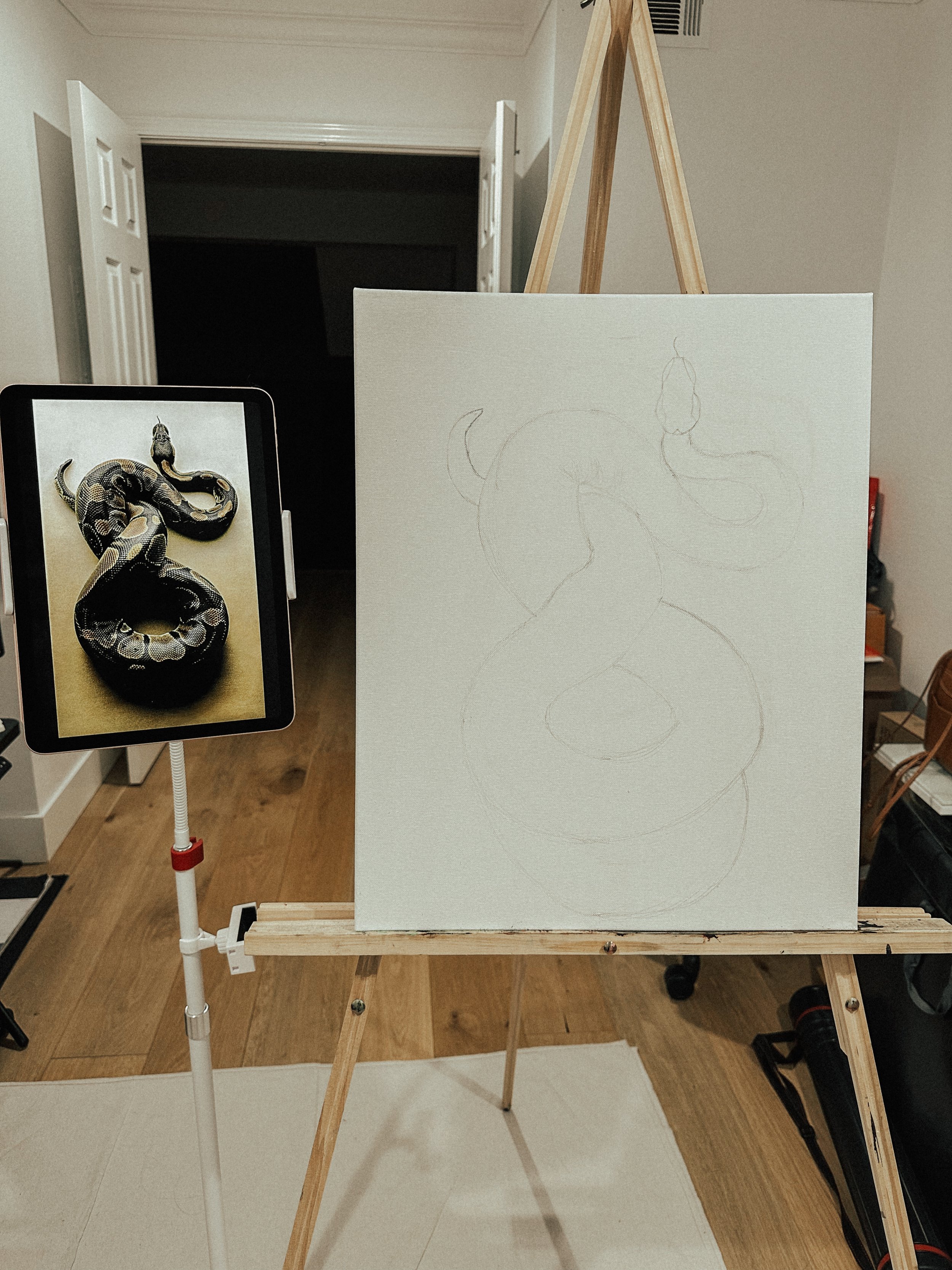
Fat over lean is a technique where we start with thinner transparent paints and then go thicker to opaque paints. We’ll start with a basic pencil sketch, then spray the sketch with fixative. Then we’ll do an underpainting, using the thinner, transparent paints, to block in the color of the snake as well as creating an abstract background.
Starting with a basic pencil sketch
Transparent underpainting with 3-6 colors
Starting with a larger brush, I paint the body of the snake and then add in the details with smaller brushes.
Painted the snake body
Working on the details now
The final painting
Materials Used:
Milan Art Institute Mastery Program Review: Week 6 Part 1
I’m splitting this week up into two posts since it’s taken me longer to finish this time around.
Drawing Gestures with Model
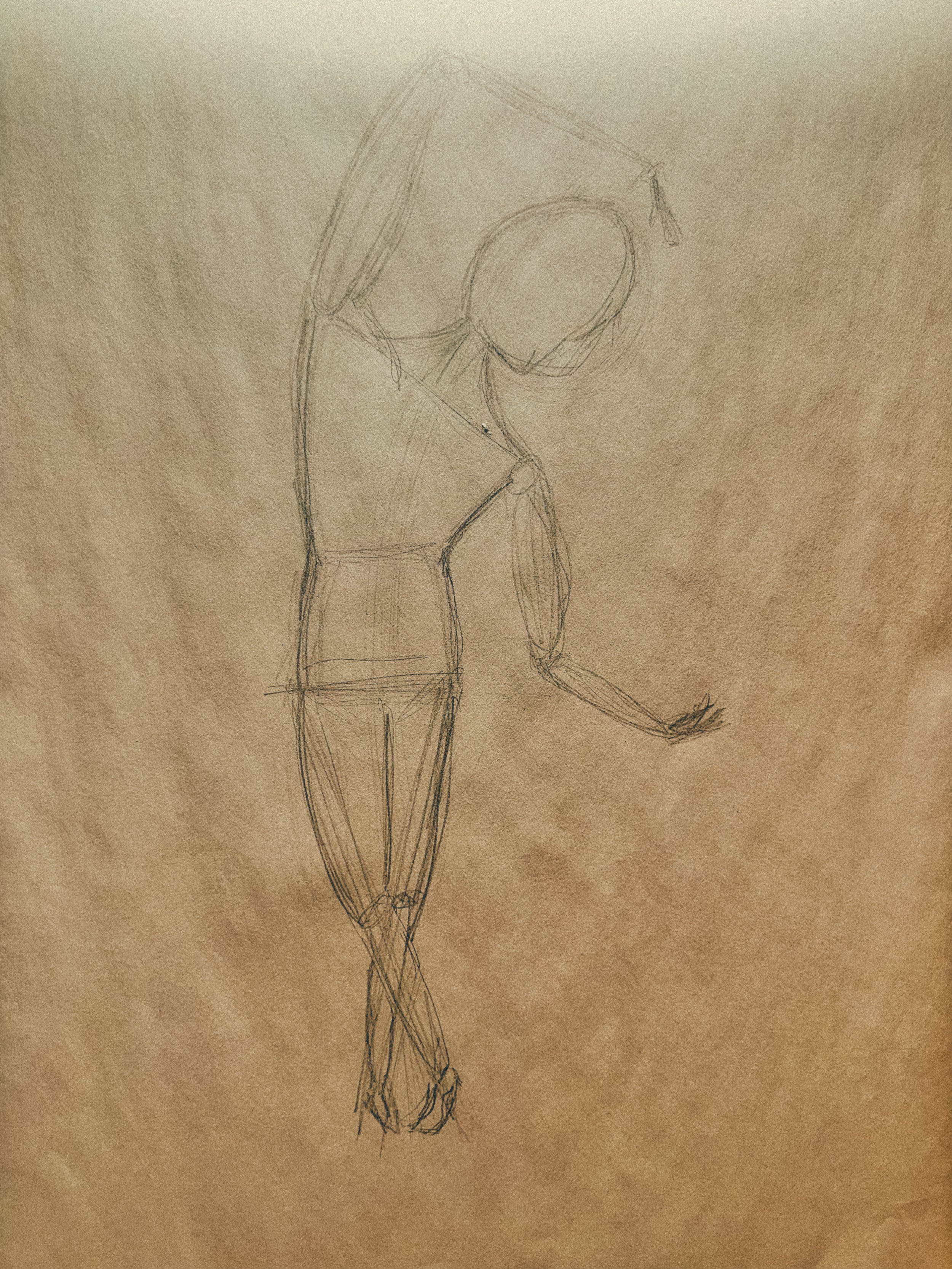
The goal with gesture drawing is to convey the weight of the body. We start by making a circle for the head and a line for the center axis. Then some lines for the shoulders, hips (where the middle of the body is), and legs.
A common mistake, mentioned in class, is drawing the head too large and the legs too short. So I tried to be really conscious of not making that mistake, purposely focusing on making the legs long enough so the hips are in the middle of the whole body. To help with proportions, we learned a method in class called counting heads. Basically, use the length of the head as a guide to count head lengths along the rest of the body. So if the model is seven heads long, the drawing should correspond to that.
For this practice, we are also focusing on speed and quantity with time spent on a gesture ranging from one to ten minutes.
The intention for this part of the lesson is to use a model. However, for this set of gesture drawings, I used a video from New Master’s Academy on Youtube. I didn’t have a volunteer available to pose at the time, so the Youtube video really came in handy.
Drawing Gestures from Photo
This is another gesture drawing assignment but from a series of photos this time. There are four different sources, spending 20 minutes on each source.
Expressive Statue Drawing
I used charcoal for this assignment. The goal is for the drawing to be partially realistic, partially abstract and to play with different lines and values. The source photo reminded me of the statues at the Uffizi Gallery in Florence.
Milan Art Institute Mastery Program Review: Week 5
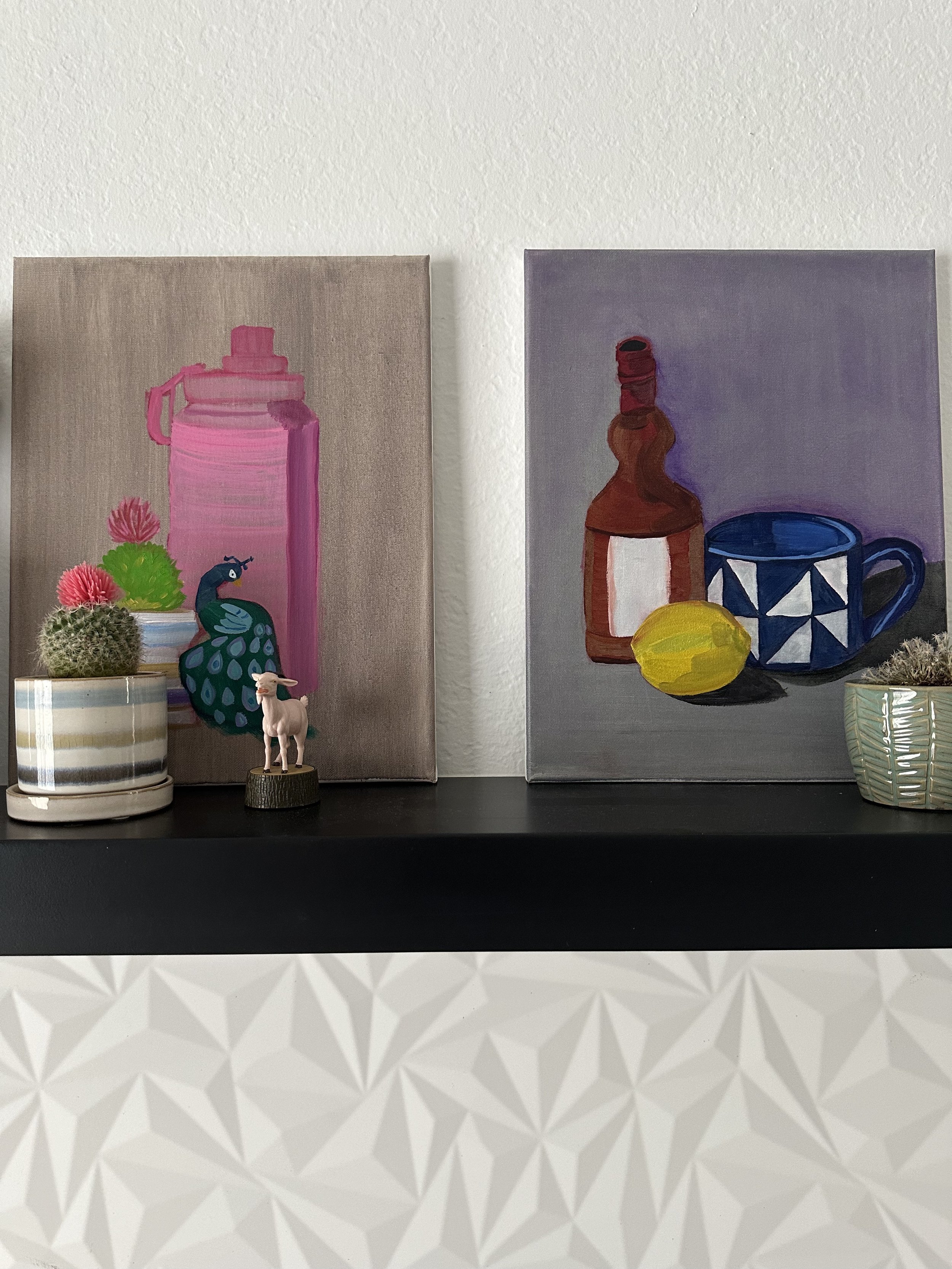
This week is a break week. It looks like the program has a break week every fifth week or so, which is awesome. The break week is also the time to finish up any unfinished projects or to do any catch up work.
I feel like I’ve learned a lot in the first four weeks of lessons and have had a lot of practice with all the assignments. It’s been fun and also great to have a little bit of a breather. Hope y’all have a good week and see ya next time!
Introduction to oil painting
Proportion
Color theory
Shading and value
Oil painting
Graphite drawing
Plane shifts
Charcoal still life
Flesh tones and complementary colors
Charcoal still life
Alla prima painting


