Milan Art Institute Mastery Program Review: Week 2
Shading and Value Scale
So for week 2, in our drawing class, we are learning about shading and values. The value scale goes from 1-9 with 1-3 being highlights, 4-6 midtones, and 7-9 would be the darkest shades. 5 is the middle grey.
For the value scale assignment, I created scales using different types of charcoal and graphite. I also tried practicing cross-hatching to make the scales.
Vine charcoal felt like it was the easiest to use and the most forgiving, which is why it is recommended for beginners. With the vine, it’s very soft and I could take a lot off the paper by rubbing with my finger, so it was easy to erase when I made mistakes. Vine charcoal is made from burning grapevines and is slightly harder than willow charcoal, made from willow branches (source). Initially I was confused between the two, but they are different.
Charcoals were also a bit more dusty in my opinion. Softer and easier to get a very dark shade. Graphite is basically pencil lead. The compressed graphite felt like holding a thick stick of pencil lead and the graphite pencils were just regular pencils.
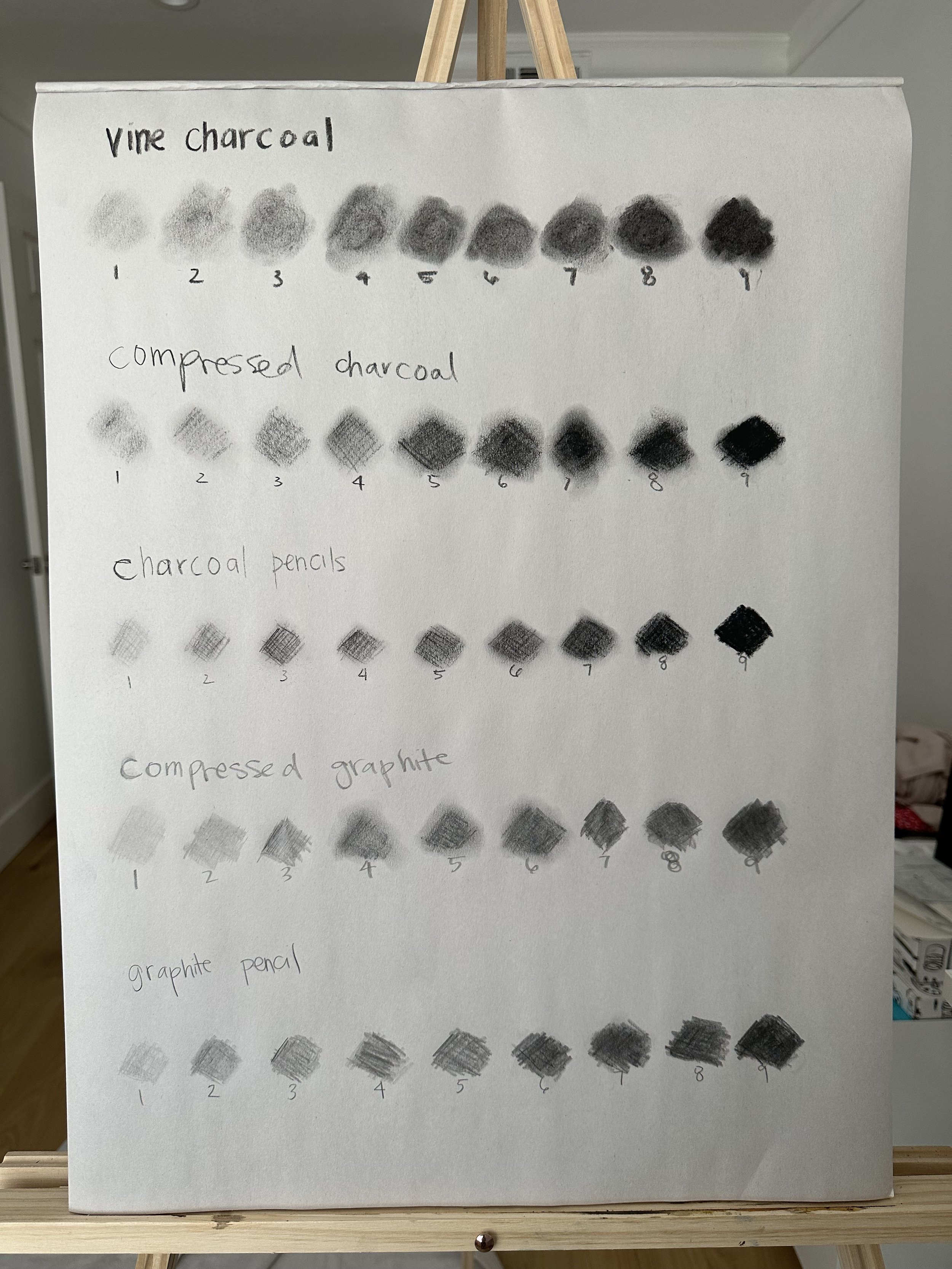
Shading and value scales in different types of charcoal and graphite
Radiant Underpainting
For week 2’s painting part of the class, we are using the Gamblin Radiant colors. The first step of the process is the underpainting. Here we are focusing on just the colors, not the values for this assignment. We want to block in the basic colors from the source photo. Since this is a landscape, we have an atmospheric or clamshell perspective. So we want to use cool colors on the horizon line, this is the part of the painting that is receding backwards. We want to use warm colors closer to the top and the bottom of the painting as this is the area that is coming forward or approaching the viewer.

Radiant underpainting
Spheres Shading and Value Drawing
Now back to drawing class. The drawing and painting assignments typically alternate. I thought this was nice and I believe the purpose is to allow enough time for the painting to dry. I also like alternative activities as it gives some variety. For the spheres assignment, we draw several different spheres with different light sources. I used the different charcoals I had also - vine, compressed, and pencil.
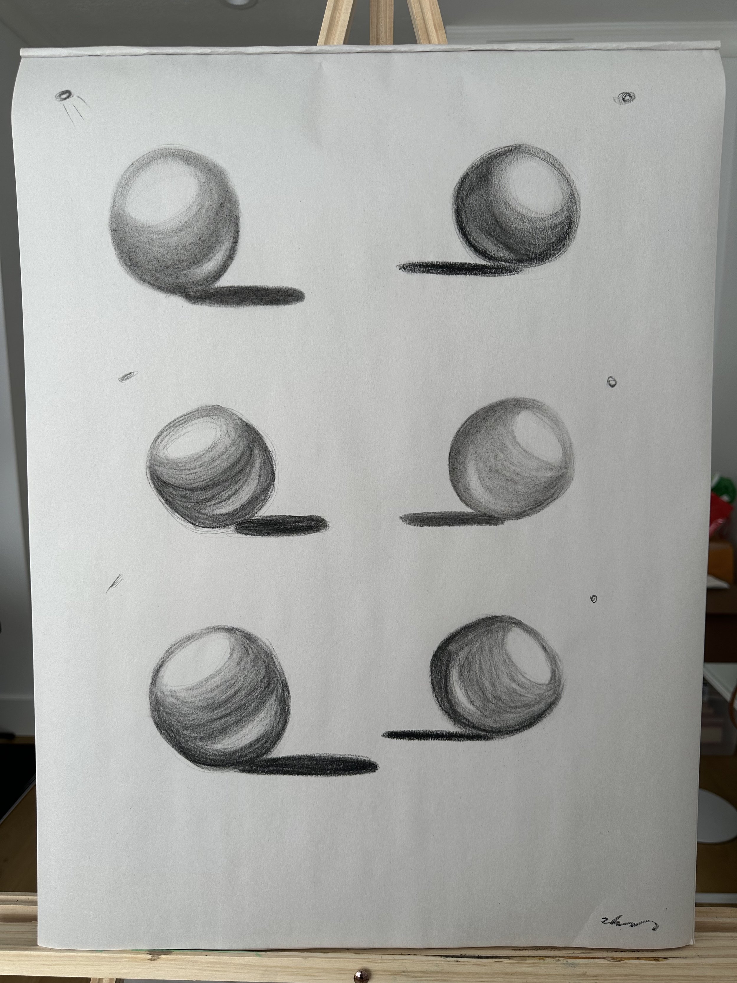
Spheres charcoal drawing
On each sphere, there are several areas we want to make sure to include. The first is the highlight, which is the lightest portion at the top of the sphere were the light is hitting it. The core shadow is the shadow around the body and bottom of the sphere. The reflective light is a highlight within the core shadow, above the cast shadow, which is the shadow the sphere casts on the ground or surface the sphere is sitting on.
The other graphite drawing assignment is the three pears. There are three pairs sitting in a row on a semi-reflective surface, so the pears also have sort of mirror shadows below them. The time limit on this one was 1.5 hours and I ended up rushing at the 20 minute mark. I got really in the zone and lost track of time. Overall, I’m pleased with how they turned out, especially for only being week 2.

Subtractive Glaze
This is my favorite part of the oil paintings - the subtractive glaze. We used the same linseed oil and solvent mixture from week one. For the glaze, I used ivory black plus dioxazine purple. The instruction is to use ivory black in addition to a cool transparent paint. This paint should be the darkest shade in the source photo. My source photo had a purple hue on its darkest parts so I chose dioxazine purple since that’s the cool transparent purple I had on hand.
So the goal here is to subtract out the mountains, grasses, etc. to uncover the bright colors underneathe. To subtract, I mostly used paint brushes and q-tips as I seem to have misplaced my Kemper Wipe Out Tool. This is why a clean and organized studio is important! (As you can see in the little bits of background to the sides of my easel, I am slowly working on getting cleaner and more organized.)

Subtractive glaze phase of the painting process
Opaque Layer
Similar to last week, opaque painting is dark to light and starting with what’s furthest away to what is closest.
Unfortunately, my painting did not turn out how I wanted it to. I had trouble representing the fog by the base of the mountains and also reflected in the water. In fact, it is not clear that the reflection of the mountain is because there is a lake there. I feel I need more brush stroke variety as well. Some parts like the left corner of the sky feel too smooth.
I had a tough time mixing colors on the fly as well. I was pleasantly surprised the grass and flowers turned out not too bad, especially in the middle and right hand sides (when looking at the painting). So now I am wondering, how do I mix colors better? Better as in quicker, more accurately, and in the appropriate amount?

Final radiant painting
Overall, I had a fun time with week 2 as well. Considering how many paintings I’ll create this year, some of them are bound to be duds. And that’s okay! It is all part of the learning process. Let me know any thoughts or questions in the comments. See y’all next week for week 3!
