Milan Art Institute Mastery Program Review: Week 7
I was a bit nervous for this week as it is about perspective, which has typically been challenging for me. I feel it’s the use of the straight edge that puts me into left brain mode, then suddenly I need everything to be pixel perfect.
This week also took me a while to get through (which is why this was published on the 25th instead of the 11th). And starting this week, I’ve also been trying to increase my speed. So this might lead to more unfinished assignments while I attempt to stay within the time limits for each assignment.
One Point to Three Point Perspective
One point perspective has vertical and horizontal lines. Two point perspective has vertical lines, but no horizontal lines.
Three point perspective has no vertical and no horizontal lines. All the lines are at an angle.
The first practice assignment. I learned the letters in “One Way” and “Broadway” need to be drawn in perspective as well. Totally didn’t realize that before!
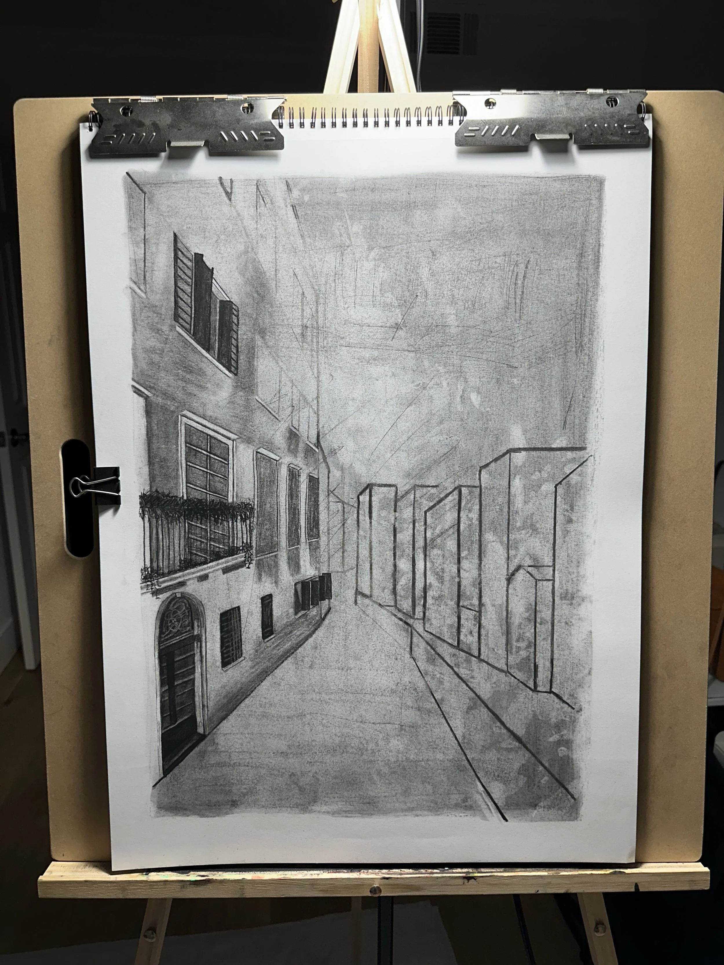
Charcoal City Subtraction
Similar to previous charcoal assignments, we start with making a ground, then subtract the highlights, and add in the darker values. Concentrate on the biggest parts of the source first, then work down to the details. 3 hours maximum on this assignment.
Crowd of People with Charcoal
Start with the ground, then subtract highlights, add darker values. Try looking at the crowd as a whole, instead of isolating single people. I’m imagining the crowd needs to be kind of blobby and abstract to reduce the amount of visual information. A tip that really helped me: when subtracting out, look for the negative space. Also, don’t outline the people. Concentrate on getting the appropriate tone next to another tone in order to create shapes and edges.
Subtractive Underpainting, Creating Depth, and Opaque Details
Similar process to previous paintings. Choose 4-5 cool transparent paints for the background. Look at value instead of color. Subtract out the light parts. And don’t forget to always mix black with another color so it looks more natural.
Next is a quick glaze layer. I felt this really helped with parts of the painting where the sunlight is hitting the buildings. Using a transparent yellow gives that sunshine-y glow while still allowing the underpainting color to show through. Glaze light to dark, then it’s time for the first opaque layer.
For the opaque layer, I worked background to foreground, and dark to light. Pick one area as the focal point to add more detail in, while leaving the rest of the painting looser and more abstract.
Finally, for opaque details, this is another opportunity to use the cold wax medium to add some texture to the painting. Texture works best on parts of the painting that are coming out towards the viewer. So it is a great candidate for warmer areas, like places where light hits the buildings.
Halfway through the first opaque layer
Detail shot of the people in front of the restaurant. This is my favorite part so far.
Final version
Milan Art Institute Mastery Program Review: Week 6 Part 2
Fat over Lean
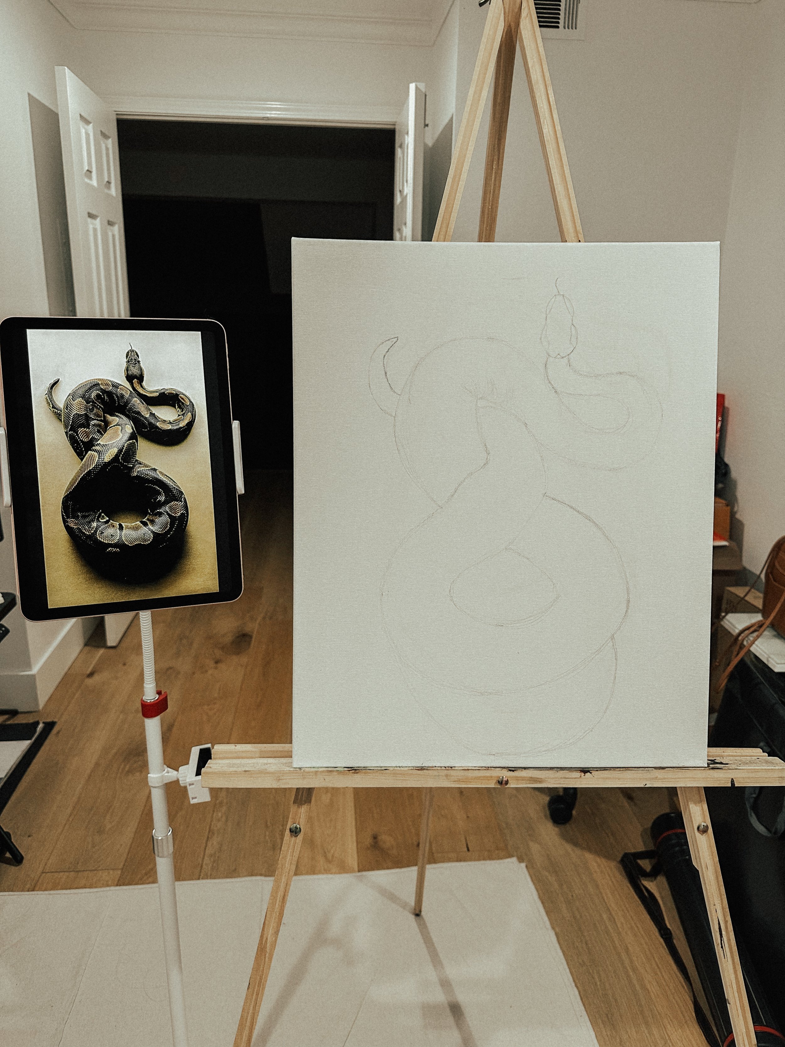
Fat over lean is a technique where we start with thinner transparent paints and then go thicker to opaque paints. We’ll start with a basic pencil sketch, then spray the sketch with fixative. Then we’ll do an underpainting, using the thinner, transparent paints, to block in the color of the snake as well as creating an abstract background.
Starting with a basic pencil sketch
Transparent underpainting with 3-6 colors
Starting with a larger brush, I paint the body of the snake and then add in the details with smaller brushes.
Painted the snake body
Working on the details now
The final painting
Materials Used:
Milan Art Institute Mastery Program Review: Week 6 Part 1
I’m splitting this week up into two posts since it’s taken me longer to finish this time around.
Drawing Gestures with Model
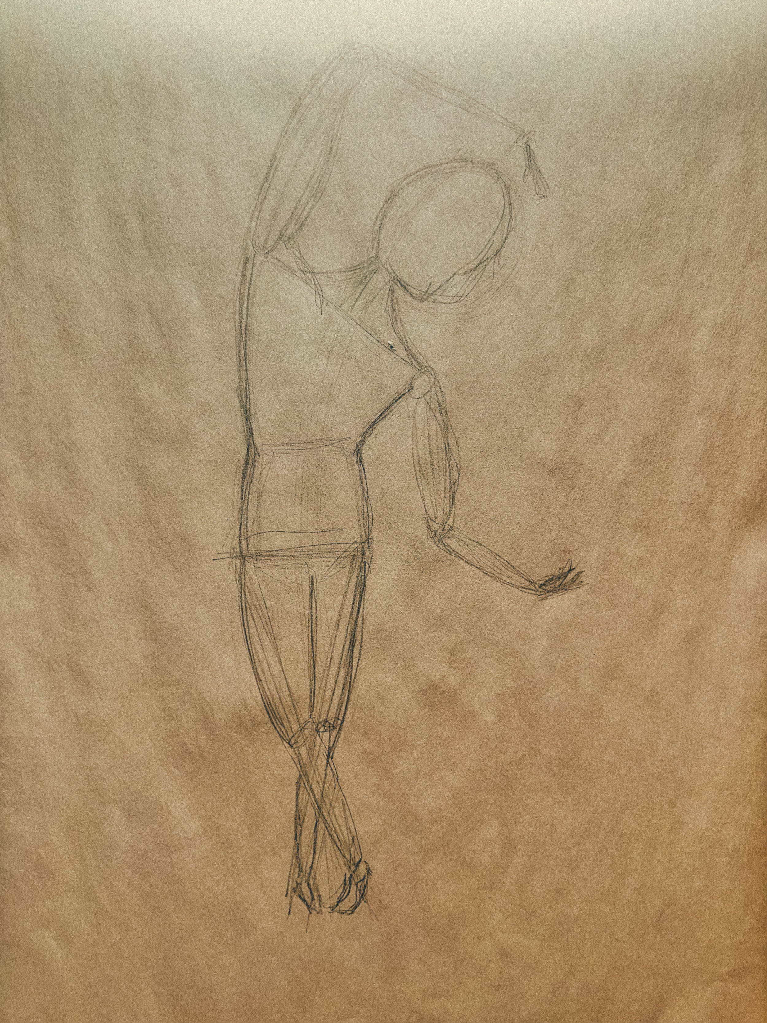
The goal with gesture drawing is to convey the weight of the body. We start by making a circle for the head and a line for the center axis. Then some lines for the shoulders, hips (where the middle of the body is), and legs.
A common mistake, mentioned in class, is drawing the head too large and the legs too short. So I tried to be really conscious of not making that mistake, purposely focusing on making the legs long enough so the hips are in the middle of the whole body. To help with proportions, we learned a method in class called counting heads. Basically, use the length of the head as a guide to count head lengths along the rest of the body. So if the model is seven heads long, the drawing should correspond to that.
For this practice, we are also focusing on speed and quantity with time spent on a gesture ranging from one to ten minutes.
The intention for this part of the lesson is to use a model. However, for this set of gesture drawings, I used a video from New Master’s Academy on Youtube. I didn’t have a volunteer available to pose at the time, so the Youtube video really came in handy.
Drawing Gestures from Photo
This is another gesture drawing assignment but from a series of photos this time. There are four different sources, spending 20 minutes on each source.
Expressive Statue Drawing
I used charcoal for this assignment. The goal is for the drawing to be partially realistic, partially abstract and to play with different lines and values. The source photo reminded me of the statues at the Uffizi Gallery in Florence.
Milan Art Institute Mastery Program Review: Week 5
This week is a break week. It looks like the program has a break week every fifth week or so, which is awesome. The break week is also the time to finish up any unfinished projects or to do any catch up work.
I feel like I’ve learned a lot in the first four weeks of lessons and have had a lot of practice with all the assignments. It’s been fun and also great to have a little bit of a breather. Hope y’all have a good week and see ya next time!
Introduction to oil painting
Proportion
Color theory
Shading and value
Oil painting
Graphite drawing
Plane shifts
Charcoal still life
Flesh tones and complementary colors
Charcoal still life
Alla prima painting
Milan Art Institute Mastery Program Review: Week 4
Drawing from Life
This lesson is about setting up our compositions for the week. We talk about the Rule of Thirds where if we have the image broken up into nine boxes, we want the focal points of the composition to be where the lines intersect. We also go over other tips like to avoid awkward angles or precarious object placements, and don’t place the objects all “facing” in the same direction. And don’t put the objects too far apart! It does seem a little bit of a Goldilocks situation - not too far, not too close, just right.
Still Life in Charcoal
While I was searching for objects for my still life composition, I noticed a discrepancy between the actual objects in my life and the objects I would want to put into a still life painting. The class gave some suggestions like fruits and vegetables, toys, and vases. I’m thinking I want fun objects - things that would be fun to paint and fun to look at.
Then funnily enough, it turns out, I didn’t really have any of those objects on hand for this first assignment. So I did find an empty wine bottle, which I shamelessly dug out of the recycling bin, an LA Chargers football helmet from the LA fair, my sketchbook, my copy of The Art Spirit by Robert Henri that I haven’t read yet, and a head of garlic from the pantry.
This whole experience reminded me of those Instagram versus reality posts. The difference between what sells, what people want to look at, and what really exists. When I think about old school still life paintings like this Dutch still life, I wonder if that painting was aspirational or reality. Did people’s tables back in the day really look like that? Or is that the food they wish they were able to eat regularly? Did they buy the objects in the painting specifically for the painting? And then, what does it mean if there is a large gap between reality and aspiration?
Random: I happened to stumble upon this fun and informative article on the history of fish in still life. I really liked the paintings featured in the article and it’s giving me some inspiration for future works.
Something else I learned: to clean the blending stumps, use sandpaper. I basically scrape the dirty parts of the stump on the sandpaper and fashion the tip into a point.
Now, to start on the charcoal drawing, first we make a ground using the jumbo willow charcoal. Next sketch in the objects, subtract highlights, and add in darker values.
Final version of my still life in charcoal
Primary Palette Still Life
First, we want to prepare the canvases by applying a neutral grey background. To make neutral grey I followed the recipe in this post by Francisco Silva using Ultramarine Blue, Burnt Sienna, and Titanium White. Then starting on painting the objects by working dark to light, ending with highlights.
The three still life paintings this week are all alla prima paintings. “Alla prima” is Italian for “at first attempt” and is a painting technique where layers of wet paint are laid down on top of previously applied layers of wet paint (source). We are also using a limited palette of three primary colors to make any additional colors needed.
Applying the grey background
My first alla prima painting
Primary Palette Still Life with Two Additional Colors
This is the same assignment as the other primary palette one except with adding two more colors. I also tried to pick objects that were a bit more colorful so they would be more fun to paint.
Choosing more colorful objects this time
2nd alla prima painting
Still Life from Photo
This assignment is basically the same as the first still life charcoal one except this time we are using a source photo instead of real objects. I specifically chose this source photo with the glasses of water in order to practice reflections since reflections were something I struggled with in week two.
Setting up the ground
The initial sketch and starting to shade in the egg
Work in progress
The final charcoal drawing
Primary Palette Still Life with Another Two Additional Colors
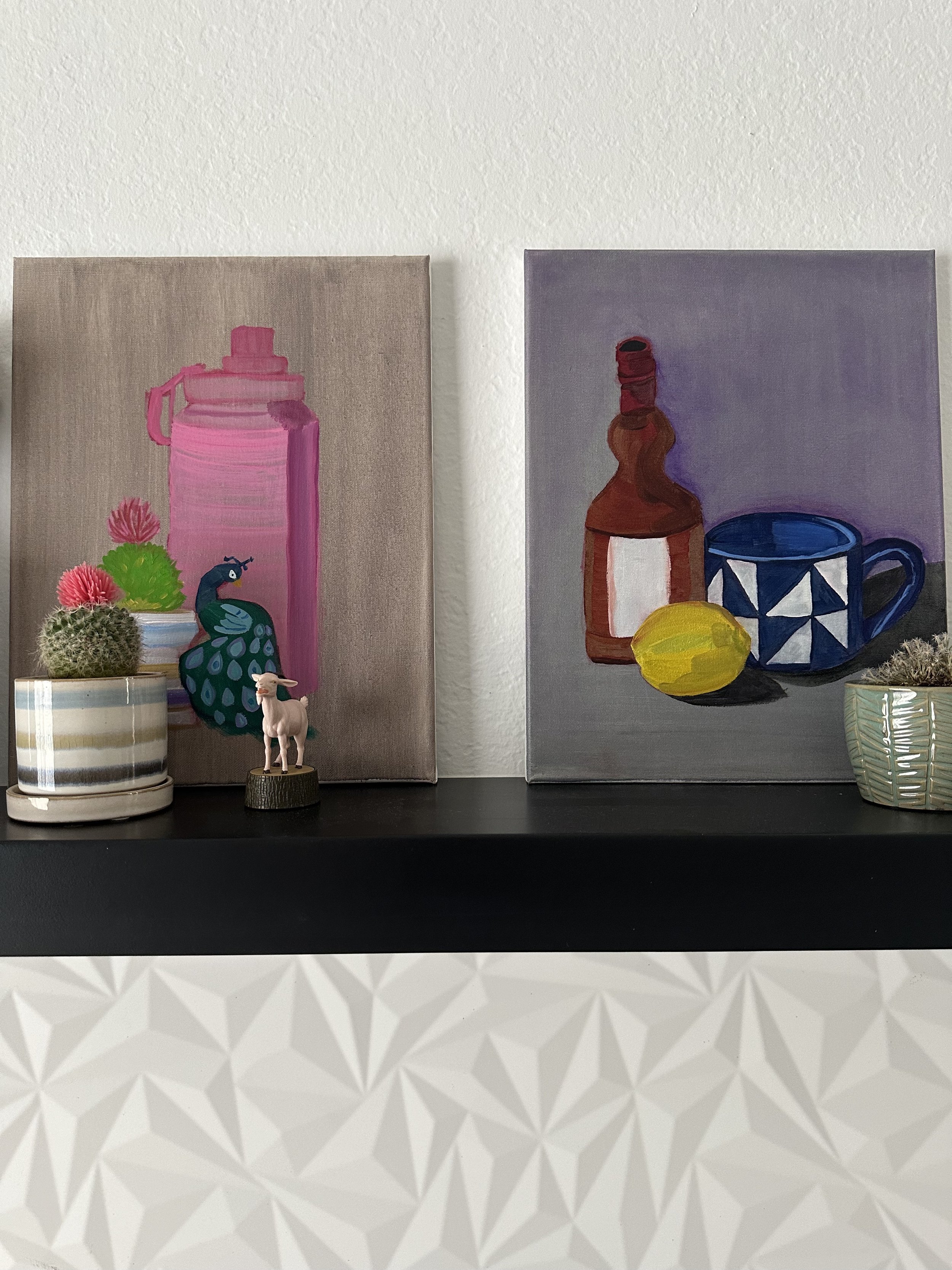
This is the third alla prima painting and the final assignment of the week. I tried to pick objects that would be fun to paint. I really enjoyed painting the little pink top on the succulent and the peacock Christmas ornament.
Alla prima still life objects
My third alla prima painting


