Daily UI: 008 404 Page
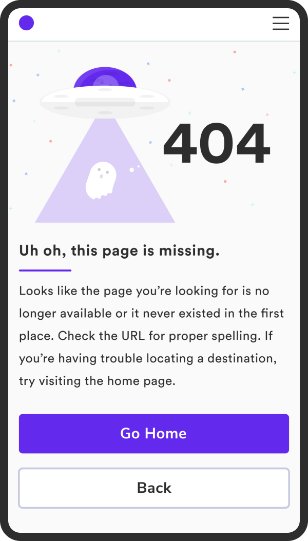
This one is a modified recycled design from one of my first projects at work. The page was coded but not pushed into the main repo. The ghost is so adorable, he’s from undraw.co. A lot of free vector graphics were used in the actual project since there were such tight timelines. Custom illustration was not prioritized.
I changed the typography and the colors from the original. Really digging this Circular Std font. It’s so friendly and bouncy. It also just says “modern tech” to me. I wanted to play with a purple-based color palette. When I was doing the challenge with all the book covers, a lot of the purple colored books were for novels with supernatural or paranormal themes. So it also seemed like a good fit for Mr. Ghosty over there.
There’s a mobile version too. Once again, didn’t place it in the final mock because its repeat content just at the smaller screen size.
Daily UI: 007 Settings
I tried something a little bit different this time with those background circles by adding a layer opacity. It’s interesting cause it seems like it adds depth, like those circles are clearly in the background and far away. Also added an oval in there. Can you spot it?
Definitely one of the quicker Daily UI challenges that I’ve done. A settings page seems pretty bland to me, in terms of styling. So I chose to showcase a Financing settings page instead. This is similar to a product that I work on in real life. Basically, a user submits their personal information for a pre-qualification, doing a soft pull of their credit. The user receives a pre-qualification offer, based on their credit score, which includes the maximum loan amount, rate, and term.
Looking at it again, the spacing between “You’ve been pre-qualified for” and the numbers is bothering me. It looks like it needs a little bit less spacing.
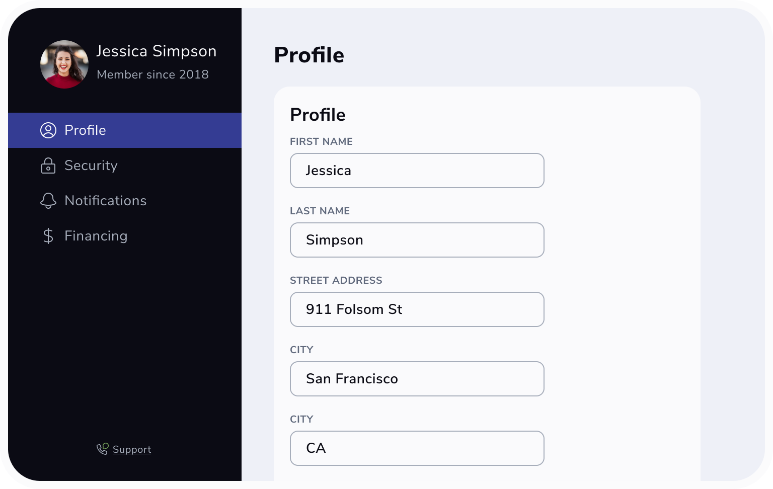
I did another screen for Profile, which is just a series of cards with input boxes the user can edit and save their information.
This one didn’t make it in to the final mockup. Laying it out with the Financing screen, I felt it was a lot of repeated elements in the sidebar to show side-by-side. The Profile card didn’t have anything super special either.
I also just noticed the card says Profile and as well as the header for the page. Seeing that now, I would change the card title to “Personal Information” or “Basics” since that contains information like name and address.
Styles for this challenge include Nunito Sans and a color palette featuring a number of grey shades.
This was my first time trying a dark mode UI. Personally, not my favorite but I know dark mode is very popular.
Sometimes I think these challenges turn out better when I do them over the course of a few days. It gives me more time to digest and revise.
Daily UI: 006 User Profile
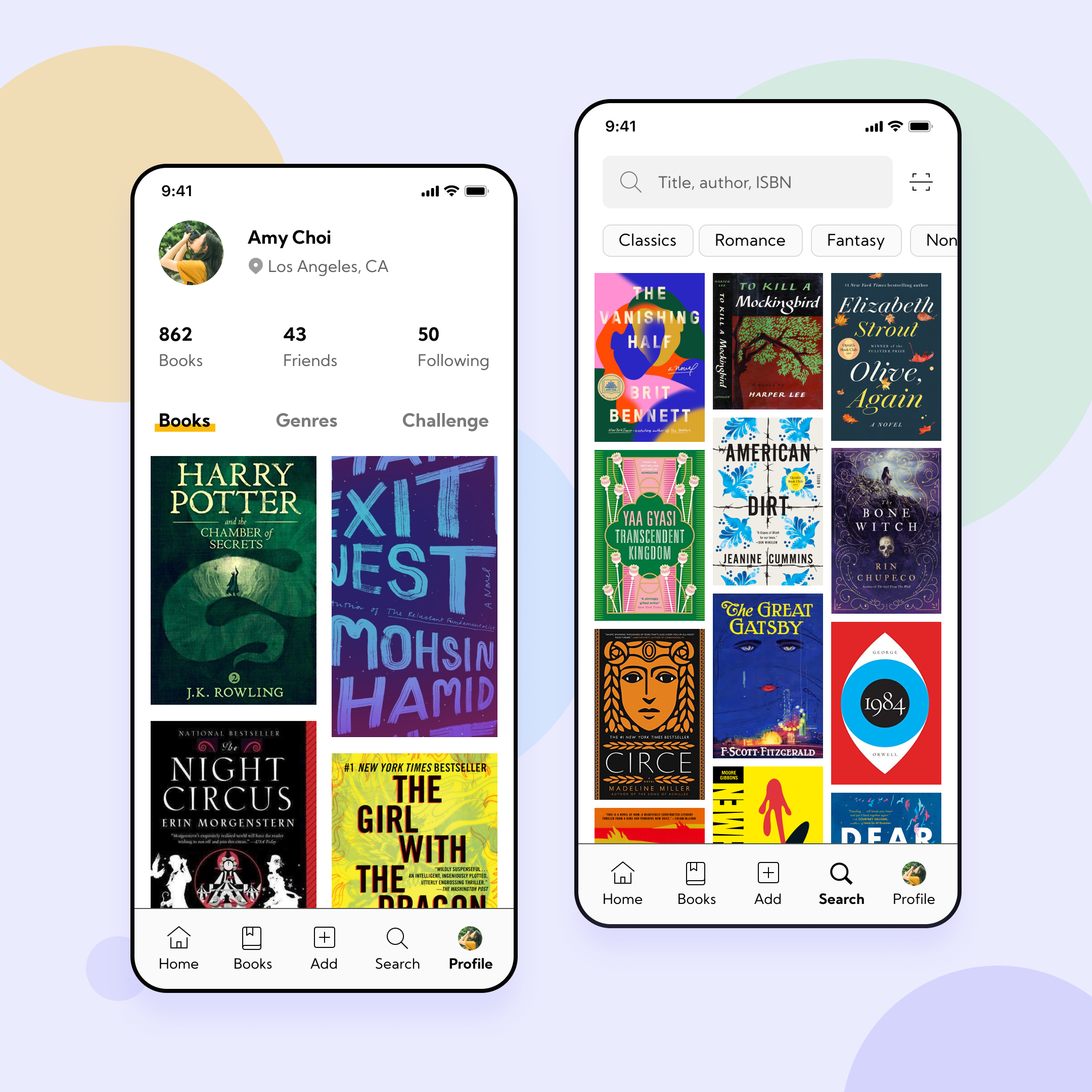
I feel like I need different ways of decorating the background of these mockups other than my opaque circles. The UI on this was actually relatively simple - basic profile information like a photo, name, location, “posts”, friends/followers, and following.
I also did a screen for what the search page would look like. The idea is the user can search by title, author, or isbn. There’s also a barcode scanner to the side of the search bar. Simple quick filters by genre that scroll horizontally. The most popular genres are displayed first on screen. Followed by a curated grid of books that are suggested according to user preferences based on what books they’ve read and how they’ve rated them, as well as books in the user’s “want to read” list.
Looking back on this, I’d change the color of the bottom tab bar icons and labels to a lighter color grey. Currently, they seem like they have too much visual prominence. I also struggled with deciding to include the labels or not. I typically like to include labels for clarity since users might not know what the icons mean by themselves. Looking at other social media apps, it seems like they don’t use labels. Seen here in Twitter and Instagram.
Twitter tab bar
Instagram tab bar
When weighing between a more simplified UI and usability, I ended up using the labels for clarity anyways. I do appreciate the subtle indicators for the page the user is on, with either the color or the bold icon.
I also tried a new font today - Kumbh Sans. There’s only three variants: light, regular, and bold. At first, I thought that might be restrictive, but for these screens with minimal text, only have a few options helped me make decisions more quickly.
Typography and color palette for this project
One issue I ran into, whether that’s with the font file or with how Figma rendered it, was that the bounding box around the text doesn’t appear to center the type within the box. Below is a comparison with Nunito Sans which works nicely in Figma. No matter how I messed with the settings or changed the line height, Kumbh Sans always had the text at the top of the box.
Some weirdness with the bounding box in Figma with Kumbh Sans versus Nunito Sans
Christmas Color Palette
Inspiration image by Rodion Kutsaev on unsplash
Trying something new here - making a color palette from an image just for fun. The way it’s presented reminds me of an eyeshadow palette with the special colors at the bottom and the photo is the main color. I got this idea from Instagram - thinking about other types of posts that are less time consuming than full UI posts but still give me opportunities to practice design.
It’s more of a muted palette. When I was experimenting with different swatches, I was getting greens that seemed too bright and clashed more with the reds.
Daily UI: 005 App Icon
It took me a while to get here but I am very happy with the results. Took a break from the Daily UI challenge due to being so busy with work and other things. I’m happy that creating gradients and the realistic shadow are becoming more second nature since I’ve been using them a lot in these personal projects. It’s coming together nicely. The side rail on this kind of reminds me of those papers when you go and pick paint for your house. One change I might make here, the middle color block blends with the background. So either lightening/darkening the background color, or adding a border around the card to help distinguish between those two elements.


